[[ Check out my Wordpress blog Context/Earth for environmental and energy topics tied together in a semantic web framework ]]

Wednesday, October 29, 2008

Significant, no hyperbole

Does anybody else even look at this stuff? Here we have one of the biggest issues facing the world, that of peak oil, and we don't even know how to analyze the data. Sigh. Oh well, here we go once again.

Let us look at the Dispersive Discovery model and the relationship describing cumulative reserve growth for a region:
DD(t) = 1 / (1/L + 1/kt) => Ureserve(t)
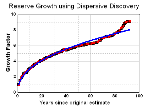
where t=time from the initial production. It gets a bit tricky to nail down the initial value for growth, as that has a big influence on the ultimate growth factor. The curve basically looks like this:


From noting in the last post that this same dependence can occur for field sizes, I realized that an interesting mapping into reciprocal space makes these curves a lot easier to visualize and to extrapolate from. So instead of plotting t against U, we plot 1/t against 1/U
1/U(t) = 1/L + 1/kt
On a linear-linear x-y plot where x maps into 1/t and y into 1/U, the linear curve looks like this:


For field size distributions, it looks like this on a log-log plot. This shows up clearly as a straight line over the entire range of the reciprocal values for the variants, if you pull the constant term into one of the two variants. This works out very well for size distributions if we scale the values to an asymptotic cumulative probability of 1.


Laherrere has long referred to "hyperbolic" plots in fitting to creaming curves. If you Google for hyperbolic Laherrere, you will find several PDF files where he describes how well he can match the growth temporal behavior to one or more "hyperbolic" curves. However, I can find no mention of Laherrere's description or derivation of the hyperbolic other than its use as a heuristic. I posted about Laherrere's use of hyperbolic curves before without understanding what he meant by them. Even the thoroughly discredited cornucopian Michael Lynch could not find an explanation:
No explanation is given for the 'hyperbolic model' or why ordering by size is more appropriate than by date of discovery.
I always assumed that a hyperbolic function either meant a slice through a conic section or this type of dependence:
y = 1 / x + c
However, none of these two behaviors really match what we see. But then a coconut fell on my head and I finally realized Laherrere probably meant the alternate version that I show in the first equation above.
1 / y = 1 / x + c
The following graph shows a typical Laherrere creaming curve analysis, where he fits to a couple of hyperbolic functions. Note that he refers to "hyperbola" in the legend. As the mellon-colored curve I plot the Dispersive Discovery cumulative . I had to slide it off Laherrere's hyperbola curve slightly since the two match exactly, which means that you couldn't tell the two apart and one curve would obscure the other.

I have no doubt that Laherrere's hyperbolas map precisely into the linear Dispersive Discovery curves. I just find it unfortunate that it has taken this long to figure this key piece of the puzzle out. So we have turned the hyperbolic fit heuristic into a model which comes about from a well understood physical process, that of Dispersive Discovery.

On another positive note, I think the reciprocal fitting (Dispersion Linearization) may become just as popular as Hubbert Linearization. From what I have gathered, people seem to appreciate straight lines more than curves. Herewith, from a classic Simpson's episode:
Professor Frink: [drawing on a blackboard] Here is an ordinary square....

Police Chief Wiggum: Whoa, whoa - slow down, egghead!
I am currently reading one of Professor Deirdre McCloskey's rants against non-scientific method mumbo-jumbo and feel a bit better at fighting the good fight against using arbitrary heuristics and qualitative analysis. Yet, in the long run, will anyone really care unless you can simplify it to two points on a line segment?

Friday, October 24, 2008

Estimating URR from Dispersive Field Size Aggregation

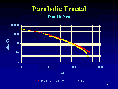
This post continues from the analysis of oil field size distribution from a few days ago. That discussion ended with questions regarding the utility of the analysis for arbitrary regions. It seemed to work well for North Sea oil but eyeballing for Mexico, the Parabolic Fractal Law looked a better empirical fit.

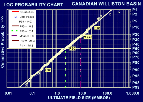
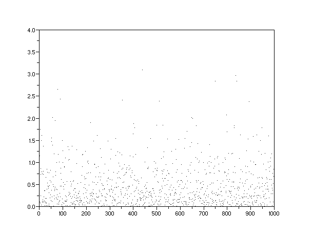
I did not talk much about the statistics of the rank histograms in the previous post. To remedy that I ran a few Monte Carlo simulations to determine what noise we can expect on the histograms. In particular, I went back to the North Sea data. The figure below shows a Monte Carlo run for the Dispersive Aggregation model where I sampled from the inverted distribution with P acting as a stochastic variate:
Size=c*(1/P-1) where P=[0..1]
For a run of 200 samples, the results look like:

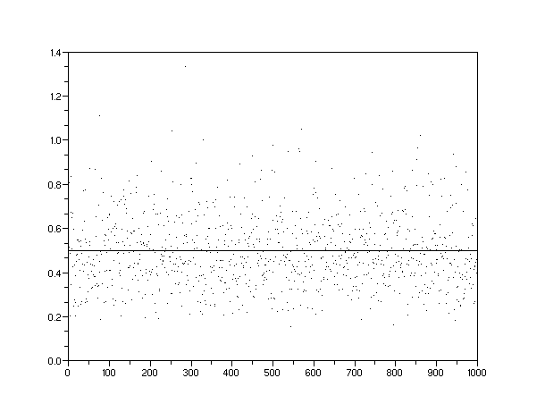
One can linearize this curve by taking the reciprocals of the variates and replotting. Note the sparseness of the endpoints which means that random fluctuations could change the local slope significantly (which has big implications for the Parabolic Fractal Model as well).

Plotting the MC data simulated for 430 point on top of the actual North Sea data and we get this:

The following figure gives a range for the single adjustable parameter in the model. For the North Sea oil, I replotted using the MaxRank and two values of C which bounded the maximum value.


The parameter C acts like a multiplier so it essentially moves the curves up or down on a log-log plot.


One can try to estimate URR from the closed-form solution but as I said before, the lack of a "top" to the data makes it unreliable. The actual distribution goes like 1/Size so that this integrates to the logarithm of a potentially large number -- in other words, it diverges. So unless one can put a cap on a maximum field size, ala the PFM's curvature, the URR can look infinite. From the model's perspective, one can emulate this behavior by not allowing a narrow window of probability for those large reservoir sizes.

In terms of geological time, we have one finish line, corresponding to the current time. But the growth lifetimes forr the dispersion to occur correspond roughly to all the points between now and the early history of oil formation some 300 million years ago. So we have to integrate to average out these times.
Cumulative (PDF(Size)) =
Integral (PDF(Size)dSize) from 0 .. Now =
Integral (PDF(kt)dt) from 0 .. Now
where the value of Now you can consider as roughly 300 million years from the start of the oil age. Small values of T correspond to the start of dispersion at longer times ago and higher values result in values closer to the present (Now) time. The number T itself scales proportionately to the rank index on a field distribution plot if dispersion proceeds more or less linearly with time (kT ~ Size). Also, a rank value of 1 corresponds to the largest value on a rank histogram plot from which can estimate Maximum Field Size. Given a mature enough set of field data, this provides close to the ceiling for where fields cannot aggregate.

We essentially blank-out a probability window for field sizes above a certain value. This gives the following from the Dispersion relation:
P(Size) = K*Integral (C/(Size+C)^2 dSize) from Size = [0..L]
P(Size) = Size*(L+C)/(Size+C)/L


... inverting

Size = C*P/(1+C/L-P)
where P=[0..1]
The following set of curves shows the dispersive aggregate growth models under the conditions of a maximum field size constraint, set to L=1000.


Converting this graph to a rank histogram and you can notice an interesting stretching going on. Since we do have a constraint on field size, we can calculate an equivalent URR for the area under the curve.


We need to use the rank histogram to get the counting correct. Then the URR derives to:
URR = MaxRank * C * ((1+C/L)*ln (1+L/C) - 1)
for most cases, this approximates to:
URR ~ MaxRank * C * (ln (L/C) - 1)
Note that the URR has a stronger dependence on the parameter C than the maximum field size L , which has a weak logarithmic behavior. I will discuss the case of the USA further down this post but keep in mind that Americans have more oil fields by far than anyone else in the world, i.e. a huge MaxRank, yet our URR does not swamp out everyone else.

To test the model against reality, I retrieved field size data from Khebab's post on oil field sizes and Laherrere's paper on "Estimates of Oil Reserves".
  • North Sea (see above)
  • Mexico
  • Norway
  • World (minus USA/Canada)
  • West Siberia
  • Niger
Plus one estimate
  • USA
This chart from Laherre shows data from Mexico superimposed with the Dispersive Aggregation model (no field size constraint). Note that the field Canterell may fall in the predicted path and not form some sort of outlier (as some have suggested due to it meteorological origin).
Free Image Hosting at www.ImageShack.us

For Norway (courtesy of Khebab and Laherrere) we get the following two curves with data separated in time by several years. Note how the Maximum Rank shifts right as the value of C grows with time. Actually this shows that we may have some difficulty in separating out the decision of not developing smaller fields with an actual physical limit on the number of small fields that we count as production-level discoveries. (Caution: The values for C are in Gb, so they have to be mutiplied by 1000 to match the other C's in this post)

Free Image Hosting at www.ImageShack.us
Old data

Free Image Hosting at www.ImageShack.us
Recent data

The World data plot (excluding USA and Canada) from Laherrere does not collect rank info from the smaller oil fields, so the vertical asymptote shown here gives a prediction of a Maximum Rank, approximately 9000 fields worldwide.

This gives a range in URR's from 1100 Gb to 1850 Gb, for values of C from 15 to 25 and a Maximum Field size of 250 Gb. I estimated the MaxRank for this model from Robelius' thesis.
An article by Ivanhoe and Leckie (1993) in Oil & Gas Journal reported the total amount of oil fields in the world to almost 42000, of which 31385 are in the USA. According to the latest Oil & Gas Journal worldwide production survey, the total number of oil fields in the USA is 34969 (Radler, 2006). The number of fields outside the USA is estimated to 12500, which is in good accordance with the number 12465 given by IHS Energy (Chew, 2005). Thus, the total number of oil fields in the world is estimated to 47 500.
From Khebab, the PFM gives a low end estimate ignoring the missing parts of the rank histogram:
Using his (Laherrere's) parameters, we can compute a world URR (excluding the US and Canada, conventional oil) equals to 1.250 Trillions of Barrels (Tb) without considering oil fields with sizes below 50 Mb.
This chart from West Siberia bins histogram data on a linear plot.


Niger Delta data does not work very well at all. This could potentially work well as a candidate for constrained reservoir sizes, yet we can not rule out the possibility that some large fields have avoided discovery thus far.
Free Image Hosting at www.ImageShack.us

I haven't found a field size distribution yet for the USA alone, but I generated the following figure as a prediction. I used a maximum rank of 34500 from Robelius's thesis and came up with two curves, with one assuming a maximum field size of 10 Gb (lower curve). The latter corresponds to a URR of 185 Gb. If I used C=0.7 and Max Field of 15 Gb, then I get URR pf 217 Gb. Ideally, I would like to get data from the USA (fat chance) to see how closely the Dispersive theory will agree with such a large (34,500) statistical sample.


Overall, most of the characteristic size (C) parameters for all the field size distribution curves fall in the range of 15 to 30 Mb (Siberia at 44), except for the USA which looks definitely less than 1 Mb. What exactly does this mean? For one, it means that the USA has a much higher fraction of smaller oil fields than the rest of the world. Is this actually due to more resources invested into prospecting for smaller oil fields than the rest of the world? Or is it because the USA has a physical preponderance of smaller oil fields? I don't know. Yet, the latter does make some sense considering how much more reserve growth that the USA shows than the rest of the world (and the number of stripper wells we have). Slower reserve growth occurs for exactly the same reason -- slower relative dispersion in comparison to distance involved -- that it does for dispersive aggregation. After all, I constructed the underlying model in identical ways, substituting natural discovery in Dispersive Aggregation for man-made discovery in Dispersive Reserve Growth.

You can well ask why the curve nosedives so steeply near the maximum rank. It really only looks that way on a log-log plot. Actually the distribution flattens out near zero and this creates a graphical illusion of sorts. The dispersion model says that up to a certain recent time in geological history, many of the oil fields have not started dispersing significantly -- at this point the slow rates have not yet made their impact and the fast rates haven't had any time to evolve. This manifests as an unknown distribution of sizes for oil fields before this point. (If you plot a population's yearly income on a rank histogram you will see this same effect, in this case due to a similar truncation due to a slow income growth early in a career). The USA field essentially has a much slower dispersive evolution than the rest of the world, so we have a much higher fraction of small fields that have not aggregated.

The Dispersive Field Size Aggregation falls into the Dispersion Theory category of models that seem to have a high degree of cohesion and connectedness. It looks like we can actually connect the dots from dispersive field sizes to the Logistic shape of the Hubbert Peak since the underlying statistical fundamentals have much commonality in terms of temporal and spatial behaviors. For now I can't find a derivation of the Parabolic Fractal Law, which to me looks like a heuristic. I always base my observations on a model. I don't lock-step believe in heuristics, mainly because I have a perhaps unhealthy obsession with understanding why a heuristic works at all (review my railing against the "derivation" of the Logistic that I have frequently written about, until I figured it out to my satisfaction). By definition, a heuristic does not have to explain anything, it just has to describe the results. And describing the results in a mathematical equation does not cut it for me. For all I know, all the Wall Street quantitative analysts (the "quants") have based all their derivative and hedge fund "models" on heuristics -- and look a where that has got us.

In my mind, Dispersive Aggregation makes a lot of sense and it seems to fit the data. I smell another TOD post brewing.

Tuesday, October 21, 2008

Dispersive Discovery / Field Size convergence

Free Image Hosting at www.ImageShack.us After having studied material nucleation and growth processes for a good portion of my grad school tenure, I think I can grasp some of the fundamentals that go into oil reservoir size distributions. I see many similarities between the two processes. For example, instead of individual atoms and molecules, we deal with quantities on the order of million-barrels-of-oil, yet the fundamental processes remain the same: diffusion, drift, conservation of matter, rate equations, etc. Deep physical processes go into the distribution of field sizes, yet I contend that some basic statistical ideas surrounding kinetic growth laws may prove more useful than understanding the fundamental physics of the process. To make the case even stronger, I use the same ideas from the model of Dispersive Discovery to show how the current distribution can arise; as humans sweep through a volume searching for oil, so too can oil diffuse or migrate to "discover" pockets that lead to larger reservoirs. The premise that varying rates of advance can disperse the ultimate observable measure leads to the distribution we see. For oil discovery, the amount gets dispersed with time, while with field sizes, the dispersion occurs with time as well, but we see the current density as a snapshot in a much slower glacially-paced geological time. For the latter, we will never see any changes in our lifetime, but much like tree rings and glacial cores can tell us about past Earth climates, the statistics of the size distribution can tell us about the past field size growth dynamics.

B. Michel provided a decent set of data for reservoir size distribution ranking of North Sea fields in his paper that I referenced here. Michel tried to make the point that the shape follows a Pareto distribution, which shows an inverse power law with size.

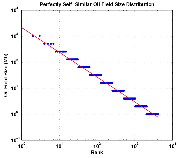
This kind of rank plot is easy to generate and shows the qualitative inverse power law, close to 1/Size in this case. The curve also displays some anomalies, primarily at the small field sizes portion and a bit at the large field sizes.

Khebab has some good background on the Pareto as well as the Parabolic Fractal Law described here. He also analyzed the log-normal used by USGS here. And he has some devised some case studies for Norway and Saudi Arabia.

Neither the Pareto nor the Parabolic Fractal Law fit the extreme change of slope near the small field size region of the curve. The log-normal does better than this but does not universally get used (it also looks very well suited to small particle and aersol size distributions). The model I use seems to work better and it derives in a similar manner to the discovery process itself. If oil can tend to seek out itself or cluster via settling in low energy states and by increasing entropy via diffusing from regions of high concentration, this itself we can consider as a discovery process. So as an analogy I assume that oil can essentially "find" itself and thus pool up to some degree. By the same token, the ancient biological matter had a tendency to accumulate in a similar way. In any case, this process has taken place over the span of millions of years. After this "discovery" or aggregation takes place, the oil doesn't get extracted like it would in a human-accelerated discovery process but it gets stored in situ, ready to be rediscovered by humans. And of course consumed in a much shorter time than it took to generate!

The following figure takes Michel's rank histogram and exchanges the axis to convert it into a regular (binned) histogram. The fitted curve assumes Dispersive Discovery via the Laplace transform of an exponentially distributed set of points. This differs from the reserve growth of discovery only in the sense that the cumulative starts from 100% instead of zero; in other words, in a region near the origin, just about all reservoirs reach at least this size. The curve essentially describes the line 1/(1+Size/20 Mb), where 20 Mb is the characteristic dispersion size derived from the original exponential distribution used. In the case of DD, 20 Mb becomes an average equivalent size that a columnar reserve growth discovery process would need to sweep through before significant discoveries would occur. For field sizes, we can use the same argument and equate this to a natural growth accumulation, where the average growth rate would start to see the effects of aggregation above the mean.


damped exponential distribution


clustered distribution after accumulation


I can see another straight line through points which would give a slope of 1/Size0.96, but in general, for this region a single parameter controls the curvature via 1/(1+Size/20 Mb). If put into the context of a time-averaged rate, where the inflection point Size = k*Time = 20 Mb, where k is in terms of average amount migrated per geological time in a region, you can get a sense of how slow this migration is. If Time is set to 300 Million years, the constant k comes out to less than 1/10 barrel per year on average. The dispersion theory gives a range as a standard deviation of this same value, which means that the rates slow to an even more apparent crawl as well as speed up enough to contribute to the super-giant fields over the course of time.

Even though the approach relies on kinetic (not equilibrium) arguments, this works out as much by a conservation of mass argument as anything else. If a volume gets completely swept out, via diffusion and seepage, and all the oil in a region congregates, it becomes the biggest possible reservoir with a rank equal to 1. Yet, it has to equal the volume of the original distribution. The curve essentially shows cross-sections of the advancing mean at various stages of time, i.e. a moving finish line. So we assume that the last, rank=1, point is the finish line. Since the dispersion assumes a constant standard deviation relative to the mean, the stationary assumption implies that the rest of the distribution fractionally scales to match the extent of the fastest flow. So I have a feeling that this recasts the fractal argument, but only adding a starting exponential distribution which eliminates the pure 1/Size dependence of the fractal or Pareto distribution.

In a global context and given enough time, this simple kinetic flow model would eventually grow to such an extent that a single large reservoir would engulf the entire world's reserves. This does not happen however and since we deal with finite time, the curve drops off at the extreme of large reservoir sizes. We can't wait for an infinite amount of time so we have never and likely will never see the biggest reservoir sizes, Black Swan events notwithstanding. So if we extended the following figure to show 1/Size dependence over an infinite range, this would of course only hold true in an infinite universe. I can't tell because of the poor statistics we have to deal with, i.e. N=small, but the supergiants might just sit at the edge of the finite time we have to deal with.

What actually happens underground? Oil does move around through the processes of drift, diffusion, gravity drainage, bouyancy, and it does this at various rates. The reason that small particles, grains, and crystals show this same type of growth also has to do with a dispersion in growth rates. Initially, all bits of material start with a nucleating site, but due to varying environmental conditions, the speed of growth starts to disperse and we end up with a range of particle sizes after a given period of time. The size distribution of many small particles and few large ones will only occur if slow growers exponentially outnumber fast growers. The same thing must happen with oil reservoirs; only a few show a path that allows exteremely "fast" accumulation ( I say "fast" because this still occurs over millions of years). From the post on marathon results dispersion, it basically demonstrates the same intuitive behavior. Only the fastest of the dispersers will maximize the amount of ground covered (or material accumulated) in a certain period of time.


The reason I wouldn't use field size distribution arguments alone to estimate URR is because no "top" exists for the cumulative size, since we do not consider the size of the container that all the fields fit in to. The Dispersive Discovery model explicitly includes a URR-style limiting container, which makes it much more useful for extrapolating future reserves. I find it interesting though in how the two approaches complement each other. Dispersive Discovery only considers the size of the container, while Dispersive Growth figures out the distribution of sizes within the container. And as long as discoveries occur in a largely unordered fashion (I assert that large oil reserves are not necessarily always found first), using the Dispersive Discovery curve makes the analysis more straightforward (no matter what the USGS says).

Khebab and Laherrere make some good points concerning the Parabolic Fractal Law as some curves show significant "bending" as this size distribution from Mexico demonstrates:

So far the Dispersive Growth field size model uses a single parameter; I figure that I have another one to spare to explain Mexico.

Sunday, October 19, 2008

Why We Can't Pump Faster

According to the Oil Shock model, to first order the rate of depletion occurs proportionately to the amount of reserve available. Overall, this number has remained high and fairly constant (I consider 5% per year high for any non-renewable resource). It takes effort to extract it substantially faster than this, but because of oil's value -- they don't call it black gold for nothing -- we never have had a reason not to extract, and so it has maintained its rate at a steady level, OPEC notwithstanding. And because the extraction rate has never varied by orders of magnitude, we have little insight into what we have in store for the future. In other words, can we actually pump faster?

The following proportionality equation forms the lowest-level building block of the Shock model.
dU/dt = -k U(t)
Any shocks come about by perturbing the value of k in the equation. Painfully stating the obvious, the values of k can go up or down. Up to now the perturbations have usually spiked downward, usually from OPEC decisions. In particular, during the oil crises of the 1970's, the model showed definite glitches downward corresponding to temporary reductions in the extraction rate imposed to member countries by the cartel (of which formed the original motivation and basis of the shock model).

The characteristic solution of the first-order equation to delta function initial conditions derives to a damped exponential.
U(t) = U0 e-kt
with extractive production following as the derivative of U(t) (the negative sign indicates extraction):
P(t) = -dU(t)/dt = k * U0 e-kt = k*U(t)
This gets back to the original premise: "rate of depletion occurs proportionately to the amount of reserve available".

As Khebab has pointed out via the Hybrid Shock Model (HSM), this gives the behavior that production always decreases, unless additional reserves get added (the extrapolation of future reserves is the key to HSM). And if we reside near the backside of a peak and without any newly-discovered additive reserves, it will go only one way ... down.

Yet we know that plateauing of the peak will likely occur, at least at the start of any detectable decline. This will invariably come about from an increase in extraction from reserves. According to the shock model, this only increases if k increases. We can model this straightforwardly:
dU/dt = -(k + ct) U(t)
Regrouping terms to integrate:
dU/U = -(k + ct)dt
ln(U) - ln(U0) = -(kt + ct2/2)
this results in
U = U0 e-(kt + ct2/2)
P(t) = (k + ct)* U0 e-(kt + ct2/2)

Notice how this gives a momentary plateau that soon gets subsumed by the relentless extractive force.

Instead of a 2nd order increase, we can try adding an exponential increase in extraction rate:
dU/U = -(k + a*ebt)dt
ln(U) - ln(U0) = -(kt + a*ebt/b)

The solution to this results in a variation of the Gompertz equation:
U = U0 e-(kt + a*ebt/b)
P(t) = (k+ a*ebt)U0 e-(kt + a*ebt/b)

The uptick of the plateau has now become more pronounced. Overgeneralizing, "we" can now "dial-in" the extension of the plateau "supply" by "adjusting" the extraction rate at an accelerating rate. I place air quotes around these terms because I have a feeling that (1) know one knows the feasibility of improved extractive technology and (2) it will eventually hit a hard downslope. Under the best circumstances we may prolong the plateau somewhat.

Conversely, assuming the conditions of a non-rate limited supply, oil producers can increase their output at the whim of political decisions. No one really understands the extent of this strategy; the producers who consider oil as a cash cow will not intentionally limit production, while those who emulate OPEC cartel practices will carefully meter output to meet some geopolitical aims. In this case, shareholders demanding the maximization of profit do not play a role.

So, what is the downside of increasing the extraction rate?
Answer: The downside is the downslope. Quite literally, upping the extraction rate under a limited supply makes the downslope that much more pronounced. The Gompertz shows a marked asymmetry that more closely aligns to exponential rise and collapse than the typical symmetric Hubbert curve.

A while back I discussed the possibility of reaching TOP (see The Overshoot Point) whereby we keep trying to increase the extraction rate until the reserve completely dries up and the entire production collapses. The following curves give some pre-dated hypothetical curves for TOP. The graph on the right shows the extractive acceleration necessary to maintain a plateau. At some point the extraction rate needs to reach ridiculous levels to maintain a plateau, and if we continue with only a linear rate of increase it starts to give and the decline sets in. Clearly, this approach won't sustain itself. And if we stop the increase completely, the production falls precipitously (see the Exponential Growth + Limit curve above).

In summary, this part of the post essentially covers the same territory as my initial TOP discussion from a few years ago, but I tried to give it some mathematical formality that I essentially overlooked for quite a while.


Do we ever see the Gompertz curve in practice? I venture to guess that yes we have. Not a pleasant topic, but we should remind ourselves that fast developing extinction events may show Gompertz behavior. Oil depletion dynamics would play out similarly to sudden extinction dynamics, if and only if we assume that oil production immediately succeeded discovery and the extraction rate then started to accelerate. Then when we look at an event like passenger pigeon population (where very limited dispersion occurs), the culling production increases rapidly and then collapses as the population can't reproduce or adapt fast enough.

As a key to modeling this behavior, we strip out dispersion of discovery completely, and then provide a discovery stimulus as a delta function. For passenger pigeons the discovery occurred as a singular event along the Eastern USA during colonial times. The culling accelerated until the population essentially became extinct in the late 1800's.

To verify this in a more current context, I decided to look at the vitally important worldwide phosphate production curve. Bart Anderson at the Energy Bulletin first wrote about this last year and he provided some valuable plots courtesy of his co-author Patrick Déry. At that time, I thought we could likely do some type of modeling since the production numbers seemed so transparently available. Gail at TOD provided an updated report courtesy of James Ward which rekindled my interest in the topic. Witness that the search for phosphate started within a few decades of the discovery of oil in the middle 1800's. Therefore one may think the shape of the phosphate discovery curve might also follow a logistic like curve. But I contend that this does not occur because of accelerating extraction rates of phosphate leading to more Gompertz-like dynamics.

The first plot that provides quite a wow factor comes from phosphate production on the island of Nauru by way of Anderson and Déry.

Note that the heavy dark green line that I added to the set of curves follows a Gompertz function with an initial stimulus at around the year 1900, and an exponential increase after that point. The total reserve available defines the peak and subsequent decline. The long uptake and rapid decrease both show up much better with Gompertz growth than with the HL/Logistic growth. This does not invalidate the HL (of which Dispersive Discovery model plays a key role), but it does show where it may not work as well.

Remember that all the phosphate on that island essentially became "discovered" as a singular event in 1900 (not hard to imagine for the smallest independent republic in the world). Since that time, worldwide fertilizer production/consumption has increased exponentially reaching values of 10% growth per year before leveling off to 5% or less per year. Google
"rate of fertilizer consumption" to find more evidence.
As a result, fertilizer trade increased from about 2 million tons in 1950 to about 40 million tons in 1986.
Over this period, this rate compounds to 9% annually, clearly an exponential increase which menas that the phosphate component of fertilizer increased as well.

Then if you consider that most easily accessible phosphate discoveries occurred long ago, the role of Gompertz type growth becomes more believable1. No producer had ever really over-extracted the phosphate reserves in the early years, as we would have had no place to store it, yet the growth continued as the demand for phosphate for fertilizer increased exponentially. So as the demand picked up, phosphate companies simply depleted from the reserves until they hit the diminishing return part of the curve. The producers can essentially pull phosphates out of the reserves as fast as they wanted, while oil producers became the equivalent of drinking a milkshake from a straw, as sucking harder does not help much.

For worldwide production of phosphates, applying the Gompertz growth from non-dispersive discoveries gives a more pessimistic outlook than what James Ward calculated. The following figure compares Ward's Hubbert Linearization against an eyeballed Gompertz fit. Note that both show a similar front part of the curve but the Gompertz declines much more rapidly on the backside. The wild production swings may come about from the effects of a constrained supply, something quite familiar to those following the stock market recently and the effects of constrained credit on speculative outlook.


So we have the good news and the bad news. First, the good news: oil production does not follow the Gompertz curve as of yet and we may not ever reach that potential given the relative difficulty of extracting oil at high rates. The fact that we have such a high dispersion in oil discoveries also means that the decline becomes mitigated by new discoveries. As for the bad news: easily extractable phosphate may have hit TOP. And we have no new conventional sources. And phosphate essentially feeds the world.

Read the rest of Ward's post for some hope:
Perhaps the best way to frame the debate from here is to suggest that, like oil, the world has been endowed with a given quantity of “easy” phosphorus (e.g. rich island guano deposits in places like Nauru) that can be – and have been – mined quite rapidly, as well as a larger endowment of lower-grade phosphate rock. While the easy phosphate has passed its peak, the low-grade phosphate should be considered separately. Figure 3 shows an example forecast where the total area under both curves (equal to RURR) is 24.3 billion tonnes, but the “easy” phosphorus (purple) is 9 billion tonnes as in Figure 2. Assuming the production history is mostly related to easy phosphorus, the fitting parameters (a and k) for the “hard” phosphorus cannot be established. Therefore, the height and timing of the secondary peak are unpredictable.


1 For a quick-and-dirty way to gauge discovery events, I used Google to generate a histogram. I describe this technique here and here. For phosphates, the histogram looks like this:

Note the big spike in discoveries prior to 1900; recent large discoveries remain rare. Prospectors have long ago sniffed out most new discoveries.


Update:
Sulfur Gompertz, used in fertilizer production as well:
Free Image Hosting at www.ImageShack.us
from http://pubs.usgs.gov/of/2002/of02-298/of02-298.pdf, ref courtesy of TOD.
Sunday, October 12, 2008

How Certain People Get Rich

I've got a post in the works describing the plateau effect in the shock model, with an eye on making it quantitative. In the meantime, I have gotten so fed up with this financial crisis, that I had to understand something about the global situation. Note the name of this post.

How Certain People Get Rich, mathematically speaking

1. Assume that people accumulate wealth linearly at the start of their careers
   Income = k * t
Read this as: if you do work steadily, you will get rewarded

2. Assume that at some point, the wealthy start accumulating assets at an exponential rate, mainly via investments.
   Income = b * exp(a*t)
In other words, once you reach a threshold, you will get exponentially rewarded with little extra work.

3. Total income combines the two.
   Income = k*t + b*exp(a*t)
You would expect that linear income starts out more strongly than that of the compounded growth exponential. Unfortunately, this turns into a transcendental function to solve for t. This will get partitioned instead of solved in a later step.

4. Assume an exponential distribution of income dispersion at any point in time. We assume a wide dispersion such that the standard deviation equates to the mean. The accumulated income at a point disperses in rate R as:
   N = N0 exp (-C/R)
This basically follows the same distribution as runners finishing a marathon race as I posted before (or searching for oil discoveries). The fastest runners occur rarely, and so do the fastest income earners.

5. We need to change this from a rate distribution to a time distribution to compare it to readily available data. First we take the derivative in (4)
   dN/dR = C*N0 exp (-C/R)/R^2
6. Next convert this to a time dependence, R ~ 1/T
   dN/dt = dN/dR * dR/dT ~ exp (-C*T)
7. The integral of this equation becomes the histogram of the income distribution, which has some dependence on the effort T put into your work
   N(T) ~ exp (-C*T)
We have not set the term T yet, but in this case it relationally equates time to Income (see update at the end of the post).

8. Plotting this for linear effort T, where income directly relates to effort expended, you get the red curve for the cumulative histogram below. Note that 100% of earners make at least $0 and then it decreases rapidly for higher incomes.


9. But from assumption (3) we know that the scale of T needs to "accelerate" to meet the needs of the exponential growth term. So if we weakly include that term near the intersection
   T ~ ln(k*Income/b)
If we plot this term in step 7, replacing T, it shows up as the green curve above.

I could iterate and solve the transcendental equation in (3) numerically but for now, it shows the relationship quite clearly.

The idea that this derivation conveys predicts that the dispersion of efforts from many income-earners (via hard-work or luck) will result in a certain segment of the population having enough assets to trigger the compound growth dependence which supplements and finally outpaces their regular income.

This paper analyzes the USA's census income data in the sense of picking out some heuristics from physics and trying to fit the curves.

It tries to cast an understanding in terms of hand-wavy statistical mechanics, but I think I have provided a better and intuitive derivation. The paper also notes that the green curve likely has to do with the stock market -- a real compound growth situation if profits get reinvested. Realize that the bottom 97 to 98% of the population never get to invoke the strong compound growth that the elite 2% to 3% do. And the dispersion continues in this term leading to the Pareto law long tails.

I have a feeling that this break in the curve represents the separation between the "haves" and "have-nots" that exist in the stock market or in investing in general. In the current market, mutual funds no longer work to create the strong compound growth for anybody but the most committed and financially backed investors. I have a feeling that the market simply "pumps" the buy/sell cycle to attract investors. I recall discussing this stuff back here.


Wall Street learned well that too many individual investors during the stock run of the 90's used ordinary mutual funds and ended up reducing the "entry barrier" and thus removing the distinction between the "haves" and "have-nots". And it clearly could not have sustained itself as you could see how much capital it would introduce into the market. They have thus tipped the scales back to a flat ratchety growth curve designed to ensnare ordinary investors (not to mention 401Ks and Social Security). If you blink like many people did the past few weeks, you miss it. The last 10 years basically came out flat. I didn't lose anything on my own investments (as I tend to stay away from risk) but I managed a fund for a relative and screwed up royally, getting out only on the downslide and losing 16%. Even the fixed income mutual funds got hammered (don't do growth bonds). I feel bad for everyone involved and it will take me a while to get over this, and hope the world economy rights itself. I'd like to say I could learn from this and put it to good use next time, but that won't happen for me. These people think the money in your wallet belongs to them, and they will do anything to get at it. And the cretins who defaulted on the bond funds probably realize the retirees that depend on this don't go around wielding baseball bats and shotguns.

What a mess!

Update: The set of two equations is actually very easy to solve. Simply parametrically plotting the two equations (3) and (7) using time (t) as the independent parameter gives this result:

This formulation does wonders for understanding what causes what. I find it interesting that I can actually extract the compound growth rate of Wall Street investments from the curve. The long tail above comes about from a 30% yearly growth rate, matching some of the high end returns in the 90's.

I will likely update this post at a later time since it combines the two growth rates, constant and exponential, that we use in the Dispersive Discovery models. The big distinction between the that model and the income model, is that the latter uses both types of growth in the same model! This suggests that it likely happens in oil discovery, of which the empirical absence has puzzled me for awhile. I assume that if we look hard enough we may see it for oil too.

Update 2: After studying the dynamics a bit more, I have decided that the compound growth part does not play as big a role as I first thought. The idea for using this adjunct form of compensation first surfaced in the referenced paper where the authors saw effects somewhat correlated to the stock market. I believe that the high income part of the curve maps to the Dispersive Discovery model with a stochastic "well of knowledge" or "depth of wisdom". We don't actually reach a specific point at which we determine our salary, but instead grow that salary over a range of years that we would willingly try to advance. For a dispersion with a damped exponential well, this leads to a straight line on the log-log plot, which matches that of the high income part of the curve. The low income part of the curve has a more rapidly declining profile, indicative of a income earner that trains for a fixed period of time and becomes satisfied with the salary at that point. This period may match the length of time for a high school education or a trade school job. On the other hand, for the higher-income earner, the training may become a life-long process, so that the goal-posts continuously expand until they reach retirement age. So I don't believe that the change in slope has as much to do with stock market fortunes as it has to do with effort expended. To first order, this effort relates to education time, continuing education, and overtime worked, leading to increased wages with experience.

The decline rate under the conditions of a variable academic stint plus a job maturation period should lead to a slope of ~ 1/t2, close to that observed (usually above 1/t1.5).


Dispersion would indicate that only a few billionaire salaries would exist, and you can see that in the extrapolated curve. Other than that, the difficulty remains in absolutely aligning and correlating time effort with an average level of salary. Empirically it looks like a power-law somewhere around 1.

Thursday, October 09, 2008

Google Discovery Timeline

I found a quite eye-opening use of the news archive feature of news.google.com. I typed in search strings for "oil" and "discovery" and "timeline", and then when you invoke the timeline view, you see this:


This search essentially looks at references to dates in archived news articles over the years and it automatically creates a histogram of the relative counts. Interestingly, it shows peaks in much the same places as the classic oil discovery curve.


I believe that the curve has a USA bias as many of the large peaks correlate with specific lower-48 discoveries, such as the historically significant field found at Spindletop right after the year 1900. And of course it nails the original discovery in 1859. Yet it predicts pretty accurately the accepted worldwide peak discovery date in the early 1960's.

Google doesn't use an AI program specifically tailored for discovering oil of course, so they cannot figure out that the dates have to solely relate to that year's oil discoveries. So we see many references to recent dates, which probably relates more to the explosion of news sources during the information age.

I would classify this as another example of the "Wisdom of the Crowds" data mining approach. This works because the dates get reported by masses of people, and this large sample collectively improve the statistical accuracy of the estimate.

Update: The Google discovery peak for coal:
Free Image Hosting at www.ImageShack.us

Sunday, October 05, 2008

The Rethug Bizness Card

Not all of us can be as smart as Sarah Palin, who knows more about energy than anybody in the world. Therefore, I created a cheat-sheet in the form of a Rethug Bizness Card. You can discretely refer to it when you want to ridicule or embarrass Republicans that you happen across. Go to the link above and print this at 25% scale and it will fit in your wallet.


It is during the second great depression in the US, and the land is full of people who are now homeless.


"You ain't stopping at this hotel, kid. My hotel! The stars at night, I put 'em there. And I know the presidents, all of them. And I go where I damn well please. Even the chairman of the New York Central can't do it better. My road, kid, and I don't give lessons and I don't take partners. Your ass don't ride this train! "


"Stay off the tracks. Forget it. Its a bum's world for a bum. You'll never be Empress of the North Pole, kid. You had the juice, kid, but not the heart and they go together. You're all gas and no feel, and nobody can teach you that, not even A-No.1. So stay off the train, she'll throw you under for sure. Remember me for that. So long, kid."