Tasseography
Oil Watch Monthly
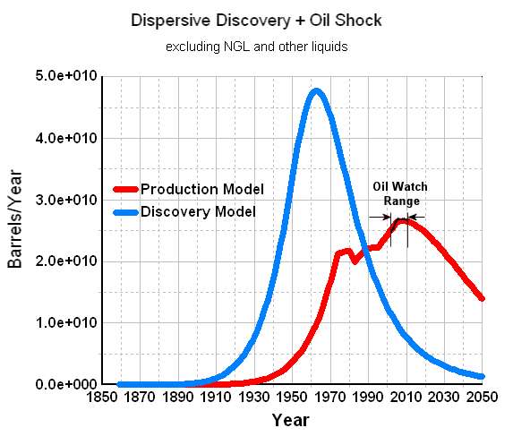
Because of the magnified nature of the production scale I find it interesting to place the data on the real scale, which shows the zeros and the full temporal range. See the short black segment in the following figure, which signifies the range reported on TOD.
Is it because people have become accustomed to using the information for futures trading or anticipating the stock market? I presume that every little glitch provides a chance to make some money.
Or do we suffer from climate change envy where temperature trends get studied to death? That works in a different context because temperatures normally occupy a narrow range and the important signal can get buried in the measurement noise.
Or do people want to anticipate seeing that sudden, precipitous drop that will signal us going over the cliff?
More likely the answer is that we continue to plot the magnified view because we can and it gives us a strawman to argue back and forth over. The term tasseography describes this behavior.
Noise can tell us something but it to first-order it really only tells us what we already know. The fewer the number of independent measurements or actors in the market, the greater the noise and fluctuations.
posted by @whut at August 20, 2010
![]() 2 comments
2 comments
![]()