Try looking up information on the oil industry term "creaming curve" via a Google search. In relative google terms, you don't find a heck of a lot. Of the top hits,
this paper gives an Exxon perspective in regards to a practical definition for the distinctively shaped curve:
Conventional wisdom holds that for any given basin or play, a plot of cumulative discovered hydrocarbon volumes versus time or number of wells drilled usually show a steep curve (rapidly increasing volumes) early in the play history and a later plateau or terrace (slowly increasing volumes). Such a plot is called a creaming curve, as early success in a play is thought to inevitably give way to later failure as the play or basin is drilled-up. It is commonly thought that the "cream of the crop" of any play or basin is found early in the drilling history.
This seems a simple enough description and so you would expect a bit of basic theory to back up how the curve gets derived, perhaps via elementary physical and statistical processes. Alas, I don't see much explanation on a cursory level besides a bit of empirical hand-waving and statistically insignificant observations such as the Exxon paper describes. And the
#3 Google hit brings you back to the site of yours truly, who basically plays amateur sleuth on fossil fuel matters. I definitely don't have any particular hands on experience with regards to creaming curves, and won't pretend to, but I can try to add a statistical flavor to the rather empirical explanations that dot the conventional wisdom landscape. The paucity of fundamental theory combined with the fact that
my own tepid observations rank high on a naive internet search tells me that we have a ripe and fertile field to explore with regards to creaming data.
The fresh idea I want to bring to the table regards how the
Dispersive Discovery model fits into the dynamics of creaming curves. As the Exxon definition describes the x-axis in terms of time or number of wells drilled, one could make the connection that this corresponds to a probe metric that the Dispersive Discovery uses as the independent variable. The probe in general describes a swept volume of the search space. If the number of wells drilled corresponds linearly to a swept volume, then the dispersive curve maps the independent variable to the discovered volume, via two scaling parameters D
0 and k:
D(x) = D0*x*(1-exp(-k/x))
and then we map the variable
x to the number of wells drilled. Changing the
x parameter to time requires a mapping of time to a rate of increase in
x:
x=f(t)
I assert that this has to map at least as a monotonically increasing function, which could accelerate if technology gets added to the mix (faster and faster search techniques over time), and it could possibly decelerate if physical processes such as diffusion play a role (
Fick's law of parabolic growth):
diffusion =>
x = A*sqrt(t)accelerating growth =>
x = B * tNsteady growth =>
x = C * tThe last relation essentially says that the number of wildcats or the number of wells drilled accumulates linearly with time. If we can justify this equivalence, then an elementary creaming curve has the same appearance
as a reserve growth curve for a limited reservoir area. The concavity of the reserve growth curve or creaming curve has everything to do with how the dispersive swept volume increase with time:

Regarding the historical "theoretical" justifications for creaming curves, I found a few references to modeling the dynamics of the curve to a hyperbola, i.e. an x
1/N shape. This has some disturbing characteristics, principle among them the lack of a finite asymptote. So we know that this wouldn't fit the bill for a realistic model. On the other hand, the Dispersive Discovery model has (1) a statistical basis for its derivation, (2) a quasi-hyperbolic climb, and (3) a definite asymptotic behavior which aligns with the reservoir limit.
For the curious, the Dispersive Discovery model also has a nice property that allows quick-and-dirty curve fitting. Because it basically
follows affine transformations, one parameter governs the asymptotic axis and the other stretches the orthogonal axis. This means that we can draw a single curve and distort the shape along independent axis, thereby generating an eyeball fit fairly rapidly. (Unfortunately a curve such as the Logistic used in peak modeling does not have the affine transformation property, making curve fitting not eyeball-friendly).
We can look at a few examples of creaming curves and their similarity to dispersive discovery.
This site
http://www.hubbertpeak.com/blanchard/, referenced in
PolicyPete analyzes creaming curves for Norway oil:

At this point I overlaid a dispersive discovery curve over the "Theory" curve that PolicyPete alludes to:

PolicyPete does not come close to specifying his "theory" in any detail, but the simple dispersive discovery model lays closely on top of it with a definite asymptote.
Another creaming curve analysis from
"Wolf at the the Door" results in this curve:

The red curve above references a "hyperbolic" curve fit, while the figure below includes the Dispersive Discovery ft.

The fit here proves arguably better than the hyperbolic and gives a definite asymptote that a hyperbolic would gradually and eventually overtake.
One can apply the same model fitting to natural gas. From discussions at
TOD the following chart shows the continuously updated creaming curve for USA NG.
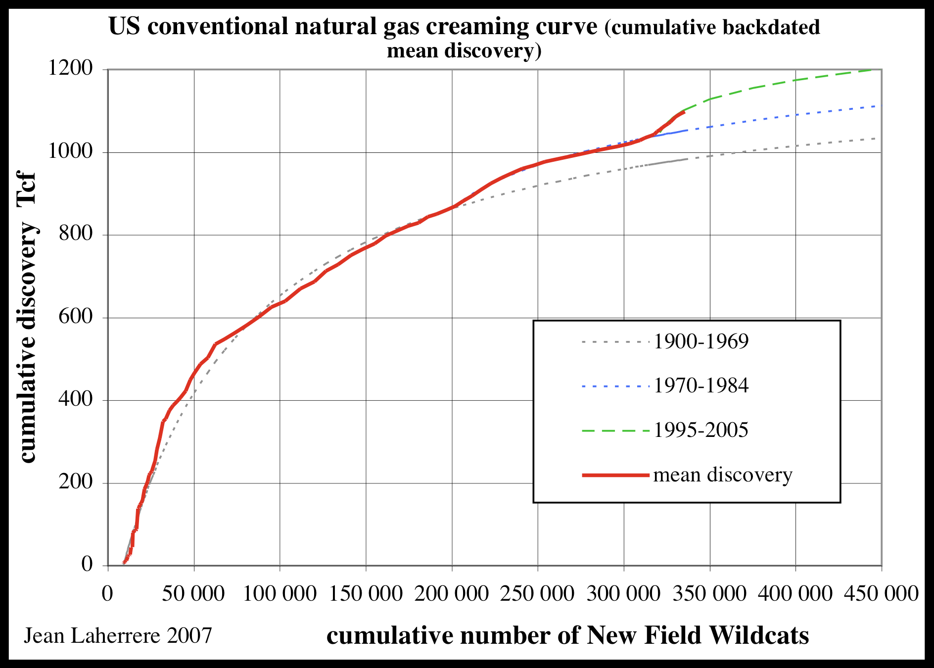
I originally did some non-creaming analysis using Hubbert's 1970's data and arrived at an
asymptote of 1130 Tcf using Dispersive Discovery. An updated curve using new field wildcats instead of Hubbert's cumulative depth drilled yields an asymptote of 1260 Tcf from a least-squares fit.

Hubbert's plot from the 1970's indicates the correspondence from cumulative footage to number of new wildcats; we assume that every new wildcat adds a fixed additional amount of cumulative footage. This allows a first-order approximation to dates well beyond what Hubbert had collected.

As a caveat to the analysis, I would caution that the number of wildcats drilled may not correspond to the equivalent swept volume search space. It may turn out that every new wildcat drilled results from a correspondingly deeper and wider search net. If this turns out as a more realistic depiction of the actual dynamics, we can easily apply a transform from cumulative #wildcats to cumulative swept volume, in a manner analogous to like we did for mapping time to swept volume in the case of reserve growth.
I like how this all fits together like a jigsaw puzzle and we can get a workable unification of the concepts behind technology assisted discovery, creaming curves, and the
"enigmatic" reserve growth. It also has the huge potential of giving quantitative estimates for the ultimate "cream level" thanks to the well-behaved asymptotic properties of the dispersive discovery model. And it basically resolves the issue of why no one has ever tried to predict the levels for the "hyperbolic" theory, as no clear asymptote results from any hyperbolic curve without adding a great deal of
complexity (both in understanding and computation).
Update:Laherrere provides a post to TD on
Arctic creaming curves
ME: Yes, good to see someone here that essentially produces half the referenced and cited (and high quality) graphs concerning oil depletion.
The one pressing question I always have is how the interpolated and extrapolated smooth lines get drawn on these figures. We all know that the oil production curves tend to use the Logistic as a fitting function, but we don't have a good handle on what most analysts use for discovery curves and creaming curves. In particular I have seen several references to creaming curves being modeled as "hyperbolic" curves yet find little in fundamental analysis to make any kind of connection.
Based on statistical considerations I am convinced that the discovery and creaming curves result from a relatively simple model that I have outlined on TOD. I have a recent post where I make the connection from dispersive discovery to creaming curves here:
http://mobjectivist.blogspot.com/2008/03/creaming-curves-and-dispersive....
In the following figure I apply the Dispersive Discovery function to one of the data sets on your graph. This function is simple to formulate and it produces a finite asymptote which you can use to estimate the "ultimate discoverable" (150 GBoe for NG in the following).
Response from Laherrere.
Every time that I plot a creaming curve, I am amazed to see how easy it is to model with several hyperbolas, but this doesn't explain why, except that on earth everything is curved. Linear is just a local effect (horizontal with the bubble, vertical with the mead) being the tangent of a curve. I found the same thing with fractals: it is a curve, so I took the simplest second degree curve : the parabola.
For creaming, hyperbola is the simplest with an asymptote. But the most important is to use several curves because exploration is cyclical. But another important point is to define the boundaries of the area. If the area is too big, it may combine apples and oranges making it difficult to find a natural trend. If the area is too small it will have too little data to find a trend. The best is to select a large Petroleum System which is a natural domain. The Arctic area is an artificial boundary and not a geological one.
I agree that the bigger the better, as the statistics improve and local geological variations play less of a factor.