Bird Surveys
This post either points out something pretty obvious or else it reveals something of practical benefit. You can judge for now.
I briefly made a reference to bird survey statistics when I wrote this post on econophysics and income modeling. I took a typical rank histogram of bird species abundance and fit it the best I could to a dispersive growth model, further described here. The generally observed trend follows that many species exist in the middle of abundance and relatively small numbers of species exist at each end of the spectrum -- few species exceedingly common (i.e. starling) and few species exceedingly rare (i.e. whooping crane). Since the bird data comes from a large area in North America, the best fit followed a meta-community growth model. The meta-community adjustment impacts the knee of the histogram curve and broadens the Preston plot, effectively smearing over geological ages that different species have had to adapt.
If we assume that the relative species abundance has a underlying model related to steady-state growth according to p(rate), where rate is the relative advantage for species reproduction and survival, then this should transitively might apply to disturbances to growth as well. Recently, I ran into a paper that actually tried to discern some universality in diverse growth papers, and it coincidentally used the bird survey data along with two economic measures of firm size and mutual fund size.
- Schwarzkopf, Yonathan, and J. Doyne Farmer, “The Cause of Universality in Growth Fluctuations.” Santa Fe Institute, (April 2010).
- Schwarzkopf, Yonathan, and J. Doyne Farmer. “Supporting Information — The Cause of Universality in Growth Fluctuations.” Santa Fe Institute.
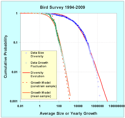
I applied the same abundance distribution as before and came up with the fit below (see blue and red curves below, data and model respectively). That provided a sanity check, but Schwarzkopf and Farmer indicated that the year-to-year relative growth fluctuations should also obey some fundamental behavior through the distribution of this metric:
RelativeGrowth(Year) = n(Year+1) / n(Year)Sure enough, and for whatever reason, the "growth" in the surveyed data does show as much richness as the steady state averaged abundance distribution. The relative growth in terms of a fractional yearly change sits alongside the relative abundance curve below (in green). Notice right off the bat that the distribution of fractional changes drops off much more rapidly.
I believe that this has a simple explanation having to do with Poisson counting statistics. When estimating fractional yearly growth, we consider that the rarer bird species having the lowest abundance will contribute most strongly to fluctuation noise on year-to-year survey data. Values flipping from 1 to 2 will lead to 100% growth rates for example. (We have to ignore movements from 1 to 0 and 0 to 1 as these growths become infinite.
I devised a simple algorithm that takes two extreme values (R greater than 1 and R less than 1 ) and the steady state abundance N for each species. The lower bound of:
R1 = R * (1-sqrt(2/N))/(1+sqrt(2/N))and the upper bound becomes:
R2 = R * (1+sqrt(2/N))/(1-sqrt(2/N))The term 1.4/sqrt(N) derives from Poisson counting statistics in that the relative changes become inversely related to the size of the sample. We double count in this case because we don't know whether the direction will go up or down, relative to R, a number close to unity.
(This has much similarity to the model I just used in understanding language adoption. Small numbers of adopters experience suppressing fluctuations as 1/sqrt(N))
Expanding on the scale, the results of this algorithm are shown in Figure 3.
Placing it in terms of a binned probability density function, the results look like the following plot. Note the high counts match closely the data simply because the 1/sqrt(N) is relatively small. Away from these points, you can see the general trend develop even though the data is (understandably) obscured by the same counting noise.
As an essential argument to take home, consider that a counting statistics argument probably accounts for the yearly growth fluctuations observed. Before you make any other assertions, you likely have to remove this source of noise. Looking at Figure 3 & 4, you can potentially see a slight bias toward positive growth for certain lower abundance species. This comes at the expense of lower decline elsewhere, except for some strong declines in several other low abundance species. This may indicate the natural ebb and flow of attrition and recovery in species populations, with some of these undergoing strong declines. I haven't done this but it makes sense to identify the species or sets of species associated with these fluctuations.
Two puzzling points also stick out. For one, I don't understand why Schwarzkopf and Farmer didn't immediately discern this effect. Their underlying rationale may have some of the same elements but it gets obscured by their complicated explanation. They do use a resampling technique (on 40+ years worth of data) but I didn't see much of a reference to conventional counting statistics, only the usual hand-wavy Levy flight arguments. They did find a power law of around-0.3 instead of the -0.5 we used for Poisson, so they may generate something equivalent to Poisson by drawing from a similar Levy distribution. Overall I find this violates Occam's razor, at least for this set of bird data .
Secondly, it seems that these differential growth curves have real significance in financial applications. More of the automated transactions look for short duration movements and I would think that ignoring counting statistics could lead the computers astray.
Epilogue
As an aside, when I first pulled the data off the USGS server, I didn't look closely at the data sets. It turns out that the years 1994,1995,1996 were included in the data but appeared to have much poorer sampling statistics. From 1994 to 1996, the samples got progressively larger but I didn't realize this when I first collected and processed the data.
At the time, I figured that the slope had a simple explanation related to uncertainties in the surveying practice. I also saw some similarities to the uncertainties in stock market returns that I blogged about recently in an econophysics posting.
Say the survey delta time has a probability distribution with average time -- the T most likely related to the time between surveys:
pt(time) = (1/T)*exp(-time/T)then we also assume that a surveyor tries to collect a certain amount of data, x, during the duration of the survey. We could characterize this as a mean, X, or some uniform interval. We don't have any knowledge of higher order moments to we just apply the Maximum Entropy Principle
px(x) = (1/X)*exp(-x/X)The ratio between these two establishes the relative rate of growth, rate = X/T. We can derive the following cumulative quite easily:
P(rate) = T*rate/(T*rate +X)The yearly growth rate fluctuations of course turn out as the second derivative of this function. We take one derivative to convert :
dp(rate)/drate = 2*T/X/(1+rate*T/X)^3On a cumulative plot as in Figure 6, this shows a power-law of order 2 (see the orange curve). Near the knee of the curve, it looks a bit sharper. If we use a uniform distribution of px(x) up to some maximum sample interval, then it matches the knee better (see the dashed curve).
So the simple theory says that much of the observed yearly fluctuation may arise simply due to sampling variations during the surveying interval. Plotting as a binned probability density function, the contrast shows up more clearly in Figure 7. In both cases is fit to X/T = 60. This number is bigger than unity because it looks like every year, the number of samples increases (I also did not divide by 15, the number of years in the survey).
But of course, the reason this maximum entropy model works as well as it does came about from real variation in the sampling techniques. Those years from 1994 to 1996 placed enough uncertainty and thus variance in the growth rates to completely smear the yearly growth fluctuation distribution.
 Figure 7 : PDF of larger sample which had sampling variations.
Note that this has a much higher width than Figure 4.
Only in retrospect when I was trying to rationalize why a sampling variation this large would occur in a seemingly standardized yearly survey, did I find the real source of this variation. Clearly, the use of the Maximum Entropy Principle explains a lot, but you still may have to dig out the sources of the uncertainty.
Can we understand the statistics of something as straightforward as a bird survey? Probably, but as you can see, we have to go at it from a different angle than that typically recommended. I will keep an eye out if it has more widespread applicability; for now it obviously requires countable discrete entities.


0 Comments:
Post a Comment
<< Home