[[ Check out my Wordpress blog Context/Earth for environmental and energy topics tied together in a semantic web framework ]]

Tuesday, September 30, 2008

The Curse of Dispersion

For the Dispersive Discovery model, the ultimate reserve reaches a bounded value. However, the growth proceeds slow but steady enough that it can fool people into a sense of complacency. The fact that geologists themselves have considered reserve growth "an enigma" indicates that they can't quite make heads or tails of how it comes about. It occurred to me that the rate of reserve growth plays in people's perceptions in rather alarming ways.

Two analogies come to mind: the carrot dangling in front of a horse and the frog being slowly boiled alive.

The fact that no one understands the enigma lets people's imaginations run a little wild as they have no checks to balance their viewpoint. Yet the fact that we have a model allows us to develop a few benchmarks that we can use as a countering influence. One that I will describe briefly comes from considering the running average time it takes to find oil in a region using the simple "seam" variant of dispersive discovery. This average has an interesting tendency to creep upwards over time.
Solving a troubling enigma can lead to a blessing or a curse.
We can evaluate this average by evaluating the definite integral of T*exp(-T/t)/t/t multiplied by t. This grows as the logarithm of t for larger times. The positive trend looks at least somewhat encouraging, but then realize that we have to divide by t to properly scale the result. After we do this scaling then we can see the law of diminishing return acting on the result directly, since the divisor t has a greater magnitude than the numerator log(t). This factor log(t)/t becomes a valuable measure to estimate return on investment.

However, non-mathematical analyses and intuition can lead to optimistic outlooks. They may forget that the beneficial dispersed growth gets more than compensated by the effort to find it and that divergence becomes greater with time. Until we get more people on board understanding the real effects we will have to suffer from the "Curse of Dispersion" -- dispersive reserve growth acts as the carrot in front of the horse, while at the same time quietly boiling us alive if we ignore its rather obvious diminishing returns.


"The picture's pretty bleak, gentlemen. ..the world's climates are changing, the mammals are taking over, and we all have a brain about the size of a walnut."

Update: Added figure

Monday, September 29, 2008

Network Dispersion

In the last post I gave examples of dispersion in the finishing times for marathon races. The dispersion results from human variability but due to (self) censoring in the population of runners, we never see complete dispersion like we would in oil exploration and discovery.

So to give a hint as to how complete dispersion works, we take an example from a physical process, that of network RTT (round-trip time) dispersion. This figure provides a classic example of packet dispersion, caused by slight differences in transmission rates of messages (taken from SLAC experiments).


I assumed a simple dispersion of rates, using T=50 microseconds, and determined the following fit:

The equation T*exp(-T/t)/t/t matches that which I use for the seam or "sweet-spot" variant of the Dispersive Discovery model. Although drawn on a semi-log scale, that shape has much similarity to a shocklet kernel with an immediate production drain on the receiving end. It also illustrates how math that works on a macroscopic scale also often applies to a microscopic scale.

I thought I came up with something new here, since the authors of the tutorial chose to use instead a heuristic (of course, similar to what everyone does for oil depletion analysis) but I believe the phenomena has some basis in what researchers refer to as "asymptotic dispersion rate" and "average dispersion rate".

To commemorate yesterday's Black Monday, I dedicate this derivation to everyone who finds it insane that no one can definitely illustrate what kind of mathematical mess that we have gotten the world financial market into. Bunch of flaming idiots.

Thursday, September 25, 2008

Marathon Dispersion

In a pending post to TheOilDrum.com, I make an analogy of oil reserve dispersive discovery to the results of a competitive foot-race such as the marathon. In this post, I take actual data from a couple of marathons and demonstrate quantitatively how a comparable dispersion occurs. Not knowing ahead of time whether the analogy had a basis beyond that of strong intuition, it surprised me that it gives such a remarkably good fit. I consider this great news in that it gives readers and lay-people significant insight into understanding how the dispersive discovery plays out in a more intuitive domain area. After all, everyone understands how competitive sports work, and a foot race has to rate as the simplest sport ever concocted.
And if they don't appreciate sports, we can always equate race results to oil businesses seeking fastest time-to-market.

The analogy of a marathon to dispersive discovery holds true in a specific situation (which we can later generalize). First, consider that the goal of the marathon lies in reaching (i.e. finding) the finish line in the shortest possible time. We make that the goal of the whole group of runners -- to achieve a minimum collective finish time. To spice things up we place pots-of-gold at the finish line -- so they essentially race to find the resource. For dispersive discovery, the goal becomes finding the oil buried in the ground by sending out a group of exploratory prospectors. The "seam" of oil below ground becomes the finish line, and the prospectors act as the runners.

The premise of dispersive discovery assumes that the prospectors have differing abilities in their speed of reaching the seam. In a large citizen's marathon, we definitely find a huge range in abilities. The spread in the distribution turns out rather large because humans have different natural abilities and more importantly, show different levels of dedication in training. Our inherent human laziness and procrastination say that the mode of the distribution would tilt toward the "low-speed" runners. Look at the following figure and imagine that the speed of the runners show a histogram distribution that leans top-heavy to the slowest of the runners.


The specific distribution shown, that of a damped exponential, has the interesting property that it has a standard deviation equal to the mean. This historically has resulted in a safe and conservative approximation for many real processes. The mode (most commonly occurring value) gives the laziest possible speed (nearing zero) and the least common gives the maximum training exertion. The distribution always has a bounded mean.

I used data from the Hawaii Marathon (also a leg of the Ironman Triathlon) to fit this dispersion model to. The Hawaii race has some interesting characteristics: it has a huge number of participants, it has no course closing or cut-off time (thus encouraging slow runners to compete), and it has a relatively small elite field. Lots of Japanese citizens enter the race. To make it more homogeneous, I decided to use only the female entrants.

I used on-line data for the finish times. The "seam"-based dispersive discovery has a simple equation N = No exp(-T/t), where N0 is the total number of finishers and N is the cumulative number at finish time t. The parameter T gives the dispersive spread. I believe the key to implementing the model correctly revolves around the premise of establishing a maximum possible speed that the runners can not humanly exceed, which equates to a minimum finishing time T0. The dispersed speeds become virtual speeds proportional to L/(t-T0). So for the equation, for convenience, we establish these artificial starting points and measure t from that new origin.

The figure below consists of over 10,000 female finishers shown by the dark line. Note that even though no official cut-off exists, the curve starts to break horizontally at 8 hours; most people consider this a natural cut-off as the human mind and body starts to get beaten down over that length of time. The model fit works very well, apart from the diverging above the natural cutoff time of 8 hours. (The dispersion eventually reaches an asymptote of 35,000)


The logarithmic plot shows an even more interesting feature. Note the bulge in the curve at early finish times. This, I contend, results from the introduction of a small elite field of competitors (perhaps 30) to the race. These elite women have greater athletic capabilities and have the carrot of prize money to justify separating the model into two components. Note however that on a linear plot, this bulge gets buried into the noise, and the statistics of the much larger mortal citizen racers takes over.


The following figure shows the histogram of the speeds for the women finishers of the Hawaii Traithlon. Plotted on a log axis, the straight line indicates that it matches the damped exponential of the assumed speed distribution. Note that very low speeds do not occur because of the natural cut-off time.


The chart below shows the R2 of the histogram for the aligned part of the model. This slope matches precisely to the eyeball fit of the cumulative finish time plot in the first figure. To get an exponential fit, I censored the data by removing the points beyond the flattened 8 hour cut-off point.


We eventually have to understand why the very slowest speeds do not occur in a competitive race. The "inverse" of the histogram, shown below plotted in time space, clearly demonstrates the lack of long finish times.

I think I can understand this just from considering the segment of the population that wishes to run a marathon. Clearly anyone who runs a marathon has some level of fitness, which means that we naturally censor the entries to those who believe they can finish without embarrassing themselves. But we also know that a significant fraction of the population has a substandard level of fitness, either from obesity, general disinterest, or various health reasons; this segment essentially comprises the tail we would normally see on a finish-time results distribution, if those non-athletes entered the race. This turns into a moot point because we will never force those people to run a race against their will. On the other hand, the oil discovery business shows no such constraint, as market capitalists will take as long as they need to get the job done, if money sits at the end of the rainbow.

As another example, the Portland Marathon has no prize money for the elite field and favors very slow runners, even so far as encouraging walkers (a quarter of the entrants). The size of the women's field exceeds that of the men's by quite a bit. No cut-off exists but the race officials reduce the support at 8 hours. In the figure below, you can see that the red line shows a definite break at 8 hours as the runners try to make it within that time (you have to set some personal goals after all).


Again the fit to dispersive discovery looks quite good over the non-censored range, especially for the female racers. The linear and log plots shown below demonstrate the same bulge for a small elite field. (The dispersion model eventually reaches an asymptote of 6100)


Portland has a much tighter dispersion than the Hawaii marathon. Even though Portland has around a third the participants as Hawaii, it finishes just as many runners within 4 hours. The prize money for Hawaii attracts a faster group of elite runners, but the average pace of Portland runners exceeds that of Hawaii by about an hour faster over the entire course.


A histogram of the rates shows the same damped exponential distribution, reinforcing the reason for the good model fit. Notice that the histogram has an even more exponential look than the Hawaii Triathlon. Since the Portland Marathon contains a huge number of female walkers (more so proportionally than Hawaii), the effect of censoring beyond the cut-off point becomes reduced even further. Again, one can ultimately imagine that if more couch potatoes who dream of finishing a marathon (a huge, huge number!) eventually entered, that the censored region would likely get populated, or at least fleshed out. They may have to resort to crawling (or a pub crawl) to finish, but that is what the statistics of the damped exponential tells us.

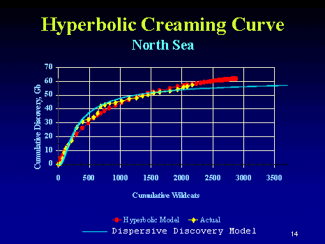
The model (and the whole analogy) works because all the runners desperately want to finish the race and thus they try as hard as they can to the best of their abilities. The same thing happens with oil exploration companies -- they will try as hard as they can to find the oil, since the potential payoff looms so large. The cumulative results of a marathon race look a lot like a discovery creaming curve, with the same "cut-off" feature. At some point, runners might decide that they can't possibly finish as they realize even walking slowly takes a toll. By the same token, the creaming curve often shows a similar horizontal cut-off asymptote whereby the oil company decides to stop further exploration as it takes a longer and longer time to find the oil at the slower rates. But as oil remains a tantalizing treasure, intrepid prospectors will keep trying and eventually break through any artificial cut-off.

This characteristic cumulative growth shape becomes the key rational for using the dispersive discovery model. Specifically, note how well this formulation can work as a predictor. We can always measure the characteristic slope early in the life-cycle and then extrapolate this simple curve to anticipate what the ultimate discovery will climb to. For marathon times, I can take a look at a fraction of the early finishers and anticipate when the rest of the field will finish. That measure alone determines the worth of a good predictor.


After finishing this analysis, I decided to look at the academic sports literature for a similar analysis. This paper The “Fair” Triathlon: Equating Standard Deviations Using Bayesian Nonlinear Models, by Curtis, Fellingham, and Reese takes a scientific approach and treads some of the same territory that I explored. Interestingly, they did not look at distributions of rates to model finishing time statistics. Rather, they decided to use the times themselves and tried to fit these to a log-normal distribution. In the time domain, the profiles look like the following:

This approach has the problem of no justification; they basically pulled the log-normal out of thin air. It looks reasonable so they use it, whereas in the dispersive discovery we actually model the behavior of the participants and then mathematically solve the model. Further, to homogenize the populations, it also makes sense to separate the males and females. Fascinating that they didn't use this simple recipe, and from the references apparently no one else does either. I double checked with a 10K race (a component of the sprint tri) and see that shorter races also do not promote long finishing time tails. Psychologically, I don't think many people want to finish last, and worse yet, well behind the bulk of the pack.

In summary, I suppose I could do a few things to inferentially prove that a long "reserve growth"-like tail exists for marathon races. One could look at health records and figure out which segment of the population has a fitness level inappropriate for running a marathon and seeing if this fraction would hypothetically fill in the missing bulk. WikiAnswers does not know the answer. Having run several marathons and tri's myself, I tend to believe that "You should be able to have a fitness level of running up to 6 miles consistently". Whatever the case the missing tail accounts for around 1/3 a sampled population and perhaps over 2/3 according to the asymptotes for the Portland and Hawaii marathons respectively. This makes sense in that finishing a marathon race should pragmatically be accessible to around half the population, otherwise it wouldn't have the popularity it has historically enjoyed, where perhaps 3-4% of Americans participate.

Once again, we find that all of sports gets reduced to probability and statistics. I knew that obsessively studying baseball card stats as a youth would eventually pay off.

Saturday, September 20, 2008

Observation of Shocklets in Action

I coined the term shocklet here to describe the statistically averaged production response to an oil discovery. This building block kernel allows one to deconstruct the macroscopic aggregation of all production responses into a representative sample for a single field. In other words, it essentially works backwards from the macroscopic to an equivalent expected value picture of the isolated microscopic case. As an analogy, it serves the same purpose of quantifying the expected miles traveled for the average person per day from the cumulative miles traveled for everyone in a larger population.

In that respect the shocklet formulation adds nothing fundamentally new to the Dispersive Discovery (DD)/Oil Shock model foundation, but does provide extra insight and perspective, and perhaps some flexibility into how and where to apply the model. And anything to unify with what Khebab has investigated, ala loglets, can't hurt.

Khebab pointed me to this article by B.Michel and noticed a resemblance to the basic shocklet curve:
Oil Production: A probabilistic model of the Hubbert curve

I did see this paper earlier in relation to the shocklet post and the referenced Stark/Bentley entry at TOD. Stark had basically taken a triangular heuristic as a kernel function to explain Dudley's simple model and made mention of the Michel paper to relate the two. Stark essentially rediscovered the idea of convolution without labeling it as such. I made notice of this at the time:
[-] WebHubbleTelescope on August 7, 2008 - 6:12pm

Khebab, I always think of the simplest explanation for a 2nd order Gamma is an exponential damped maturation/reserve growth fuction convolved with a expontial damped extraction function, ala the oil shock model.
[-] Nate Hagens on August 7, 2008 - 6:48pm
I tend to agree. This will likely be the topic of our next TOD press release.
[-] Euan Mearns on August 8, 2008 - 2:59am
If we're gonna do a press release I'd like to check the math before it goes out.
[-] Nate Hagens on August 8, 2008 - 4:37pm
Deal. As long as I check the spelling.
[-] Khebab on August 7, 2008 - 8:51pm
I agree, it's an elegant and concise solution which has many interpretations.
Michel went a bit further and although had some insightful things to say, I thought he took a wrong and misguided path by focusing on distribution of field sizes. In general, certain sections of the paper seemed to exist in an incorrectly premised mirror universe of what I view as the valid model. I will get to that in a moment. More importantly, Khebab reminded me that Michel did generate very useful data reductions from the North Sea numbers. In particular, Figure 14 in Michel's paper contained a spline fit to the aggregate of all the individual production curves, normalized to fit the production peak rate and field size (i.e. final cumulative production) into an empirically established kernel function. The red curve below traces the spline fit generated by Michel.

The green curve represents the shocklet assuming a "seam" dispersive discovery profile convolved with a characteristic damped exponential extraction rate. As one of the key features of the shocklet curve, the initial convex upward cusp indicates an average transient delay in hitting the seam depth. You can also see this in the following figure below; in which I scanned and digitized the data from Michel's chart and ran a naive histogram averager on the results. Unfortunately, the clump of data points near the origin did not get sufficient weighting, and so the upward inflecting cusp doesn't look as strong as it should (but more so than the moving average spline indicates, which is a drawback of the spline method). The histogram also clearly shows the noisy parts of the curve, which occur predominantly in the tail.

I believe this provides an important substantiation of the DD shocklet kernel. The values for the two shocklet model parameters consist of the average time it takes to reach a seam depth and the average proportional extraction rate. Extrapolating from the normalized curve and using the scaling from Michel's figure 13, these give a value of 3.4 years for the seam DD characteristic time and 2 years for the extraction rate time constant (I assumed that Michel's Tau variable scales as approximately 20 years to one dimensionless unit according to Fig.13). Note that the extraction rate of 50%/year looks much steeper than the depletion rate of between 10% and 20% quoted elsewhere because the convolution of of dispersive discovery reserve growth does not compensate for the pure extraction rate; i.e. depletion rate does not equal extraction rate. As an aside, until we collectively understand this distinction we run the risk of misinterpreting how fast resources get depleted, much like someone who thinks that they have a good interest-bearing account without taking into account the compensating inflationary pressure on their savings.

The tail of the shocklet curve shows some interesting characteristics. As I said in an earlier post, the envelope of the family of DD curves tend to reach the same asymptote. For shocklets derived from DD, this tail goes as the reciprocal of first production time squared, 1/Time2.

I also ran through the shocklet model through a Simulink/Matlab program, which has some practical benefit to those used to looking at a pure dataflow formulation of the model. A picture is supposedly worth a thousand words, so I won't spend any time explaining this :)


Turning back to Michel's paper, although I believe he did yeoman's work in his data reduction efforts, I don't agree with his mathematical premise at all. His rigorously formal proofs do not sway me either, since they stemmed from the same faulty initial assumptions.
  1. Field Sizes. I contend that the distribution of field sizes generate only noise to the discovery profile (a second-order influence) . Michel bases his entire analysis on this field size factor and so misses the first order effects of the dispersive discovery factor. The North Sea in particular has a proclivity to of course favor the large and easy-to-get-to fields and therefore we should probably see those fields produced first and the smaller ones become shut-in earlier due to cost of operation. Yet we know that this does not happen in the general case; note the example of USA stripper wells that have very long lifetimes. So the assumption of an average proportional extraction rate across all discovery sizes remains a good approximation.

  2. Gamma Distribution. This part gets really strange, because it comes tantalizing close to independently reinforcing the Oil Shock model. Michel describes the launching of production as a queuing problem where individual fields get stacked up as a set of stochastic latencies. As I understand it, each field gets serviced sequentially by its desirability. Then he makes the connection to a Gamma distribution much like the Oil Shock model does in certain situations. However, he blew the premise, because the fields don't get stacked up to first-order but the production process stages do; so you have to go through the fallow, construction, maturation, and extraction processes to match reality. Remember, greed rules over any orderly sequencing of fields put into play. The only place (besides an expensive region like the North Sea) that Michel's premise would work perhaps exists in some carefully rationed society -- but not in a free-market environment where profit and competition motivates the producers.
So connecting this to a URR, we go back to the field size argument. Michel can not place a cap on the ultimate recoveries from field size distribution alone, so ends up fitting more-or-less heuristically. If you base the cap on big fields alone, then a Black Swan event will completely subvert the scale of the curve. On the other hand, dispersive discovery accounts for this because it assumes a large searchable volume and follows the cumulative number of discoveries to establish an asymptote. Because of its conservative nature, a large Black Swan (i.e. improbable) discovery could occur in the future without statistically affecting the profile.

Besides, I would argue against Michel's maxRate/Size power-law as that convincing a tend. It looks like maxRate/Size shows about 0.1 for large fields and maybe 0.2 for fields 0.01x the size. The fact that the "big fields first" does not follow that strict a relationship would imply that the maxRate/Size works better by making it an invariant across the sizes. He really should have shown something like creaming curves with comparisons between "unsorted" and "sorted by size" to demonstrate the strength of that particular law. I suspect it will give second-order effects at best if the big/small variates are more randomized in time-order (especially in places other than the North Sea). The following curve from Jack Zagar and Colin Campbell shows a North Sea creaming curve. I have suggested before that cumulative # of wildcats tracks the dispersive discovery parameter of search depth or volume.


The blue curve superimposed shows the dispersive discovery model with a cumulative of approximately 60 GB (the red curve is a heuristic hyperbolic curve with no clear asymptotic limit). So how would this change if we add field size distribution to the dispersive discovery trend? I assert that it would only change the noise characteristics, whereas a true "large-field first" should make the initial slope much higher than shown. Now note that the authors Zagar and Campbell of the creaming curve repeated the conventional wisdom:
This so-called hyperbolic creaming curve is one of the more powerful tools. It plots cumulative oil discovery against cumulative wildcat exploration wells. This particular one is for the North Sea. The larger fields are found first; hence, the steeper slope at the beginning of the curve.
I emphasized a portion of the text to note that we do not have to explain the steeper slope by the so-called law of finding the largest fields first. The dispersive discovery model proves the antithesis to this conjecture as the shocklet and creaming curve fits to the data demonstrate. Most of the growth shown comes about simply from randomly trying to find a distribution of needles in a haystack. The size of the needles really makes no difference on how fast you find them.

I submit that it all comes down to which effect will become the first-order one. Judge on how well shocklets model the data and then try to disentangle the heuristics of Michel's model. I just hope that the analysis does not go down the field-size distribution path, as I fear that it will just contribute to that much more confusion in understanding the fundamental process involved in oil discovery and production.

Friday, September 19, 2008

What theory for peak oil?

I do realize that we have a workman-like "theory" of peak oil, but no one else has ever formally quantified -- correctly -- the theory through some basic math. Several times on this blog and elsewhere I have demonstrated how the current explanations for the Logistics sigmoid of the classic Hubbert peak rest on a premise that never made any sense from the start. Having showed that a simple yet perfectly valid math model does exist, working both on the discovery level as well as the production stage, we conceivably should start making some real headway.

[... insert predicates here ...]

Yet, it will take some effort to get this real theory to overcome inertia of the prevailing common knowledge and conventional wisdom presented just about everywhere we look now (note that these quotes all come from the same article referenced from TOD):
Every non-renewable resource coming from a finite storage can be exhausted, this exhaustion process can be described through a mathematical function and represented by a depletion curve. This theory of depletion of non-renewable natural resources was first put forward in the 1950s by King Hubert, a US geologist, based on actual observation of oil wells' production.
1. How many people realize that this version of peak oil theory largely rests on an intuitive gut-check (however brilliant) by Hubbert? Clearly, Hubbert never presented a mathematical model, and came well short of using any formality.
Peak oil theory is well grounded in physics and mathematics, and there is little controversy that peak oil production for the world will eventually be reached at some point in the current century.
2. What math? The mathematical equations used for useful analyses such as Hubbert Linearization work essentially as heuristics based on previous empirical evidence1. I would not call this well-grounded in physics and mathematics.
This discussion is really a reprise, to a large extent, of the Malthus theory on the evolution of population and the evolution of resources to sustain it, particularly production of food resources.
3. To explain the profile of oil depletion, not even close. Although we can give credit to Malthus, this point-of-view strays afar from the fundamentals of the life-cycle of oil itself.
(Brian Pursley comments) This article is wrong in so many ways I don't even know where to begin. Oil is renewable. Hydrocarbons do not take millions of years to form and whoever taught you that should go take a highschool level chemstry class. I can make hydrocarbons in the lab using only iron oxide, marble, and water (no fossils required), and it doesn't take millions of years. Why is the amount of oil a given? Do you really think you are omniscient? Yes we can increase reserves and we do so every year.

"Peak Oil theory is garbage as far as we’re concerned." -- Robert W. Esser, geologist, 2006
4. This comment on the article goes to the extreme in the other direction. I looked at the commenter's blogging profile and he claims to work as a hedge fund operator in investment banking. Although a good theory will do nothing to dissuade someone from pursuing a clear agenda of greed at all costs, we certainly can work on educating others who welcome new ideas.

So I contend that we need now, more than ever, to mathematically understand at a deep fundamental level the flow of physical resources (and monetary funds) on a global basis. If you look at the current USA fiscal crisis, you realize that mathematical charlatans had a big hand in this week's debacle. Without some counter-math, what can we do to stop the next Phil Gramm (who not only failed grade school once, but twice and then three times!) from spouting nonsense and basically laying waste to any common sense that a nation of logical citizens should bring to the table. If we can compare Al Franken (perfect math SAT score and brilliant analogist) vs. Phil Gramm (who the hell gave him a PhD?), we can potentially get on the right track.

We have nearly nailed the formal theory for peak oil and depletion (keep your eyes out for a new TheOilDrum.com post courtesy of Khebab), and I can't wait to start looking at how we can apply similar pragmathematics to other issues.


1 Even a theory like the Export Land Model, which I think has a sound fundamental basis does not get at the underling depletion behavior. It works mainly as a diagnostic tool to help people understand in terms of a zero-sum game the direction of a downturn.

Friday, September 12, 2008

Banned from HuffPo

Update: See end of post.

I got banned from commenting at HuffingtonPost.com, presumably from calling out the idiotic Raymond J. Learsy and his ridiculous posts posing as an oil authority. Every time he posted something, I commented to the effect that HuffPo should hire someone from TheOilDrum.com (any of the regulars would do) as an energy blogger. Apparently, these comments kept on getting deleted and I must have hit some threshold which prompted the banning. I usually commented words to the effect that Learsy doesn't know anything (the mean bit) and that he refuses to mention the work of the blogging world's depletion analysts (the factual part). I found only one recent post, dated April of this year, where my comment (supporting another commenter) got published:
Good comment. The math supports you. Learsy has been saying the same thing the last two years. I think he does a post about once a month and it is always the same thing. Depletion analysis is an exacting quantitative science, one which Learsy refuses to understand.
Keep up the fight on my behalf and get the wanker Learsy off the HuffPo.

BTW, I like HuffPo for everything else it does and love the regular posts by Steven Weber and Harry Shearer and the occasional gems from David Rees.

I find it really strange how someone gets anointed as an expert. Like the way that Sarah Palin has become the preeminent authority on oil in Republican circles. "In the land of the blind, the one-eyed man is king". If the politicos say she has the ranking smarts on this subject, I can only imagine how much ignorance the rest of the Rethug contingent displays. ... I take that back, I don't have to imagine; I know.

Update: I must have at least some influence as I got an unsolicited email from a reader's rep (i.e. community manager) at the HuffPo with the claim that my commenting privileges became inadvertently deactivated. So, apparently once again I can comment, and I can maintain my spotless record of never being banned from a site. Like I said, HuffPo have a great attitude and a fine pool of writers ... excepting for this guy Learsy.

Wednesday, September 10, 2008

Joker of the Hill

Why do Americans think that this woman knows anything at all about oil?
She may be traditional, but she isn't long-suffering, nor terribly quiet and can hold a grudge when appropriate.


Maybe she knows something about propane .... but oil?

I guess proximity counts.
Wife, mother, and substitute Spanish teacher, Peggy Hill is a citizen of the Republic of Texas who works hard, plays hard, loves hard, and reapplies her lipstick 30 times a day.
Have we just entered cartoon world? And when do we get out?

Sunday, September 07, 2008

From Discovery to Production

In testing out some new graphics software, I thought to put it through some paces.

This chart shows how Dispersive Discovery transforms into production via the application of the Shock Model. Each colored band corresponds to a particular discovery year. I suppose I should have done this particular plot long ago as it demonstrate the salient features of the shock model. The stacked bar chart essentially shows the effects of a multiple stage convolution on a discrete set of yearly discovery inputs.

Free Image Hosting at www.ImageShack.us (click to enlarge)

This curve features a damped exponential maturation phase.