[[ Check out my Wordpress blog Context/Earth for environmental and energy topics tied together in a semantic web framework ]]

Wednesday, March 18, 2020

Mathematical Geoenergy

Our book Mathematical Geoenergy presents a number of novel approaches that each deserve a research paper on their own. Here is the list, ordered roughly by importance (IMHO):

  1. Laplace’s Tidal Equation Analytic Solution.
    (Ch 1112) A solution of a Navier-Stokes variant along the equator. Laplace’s Tidal Equations are a simplified version of Navier-Stokes and the equatorial topology allows an exact closed-form analytic solution. This could classify for the Clay Institute Millenium Prize if the practical implications are considered, but it’s a lower-dimensional solution than a complete 3-D Navier-Stokes formulation requires.
  2. Model of El Nino/Southern Oscillation (ENSO).
    (Ch 12) A tidally forced model of the equatorial Pacific’s thermocline sloshing (the ENSO dipole) which assumes a strong annual interaction. Not surprisingly this uses the Laplace’s Tidal Equation solution described above, otherwise the tidal pattern connection would have been discovered long ago.
  3. Model of Quasi-Biennial Oscillation (QBO).
    (Ch 11) A model of the equatorial stratospheric winds which cycle by reversing direction ~28 months. This incorporates the idea of amplified cycling of the sun and moon nodal declination pattern on the atmosphere’s tidal response.
  4. Origin of the Chandler Wobble.
    (Ch 13) An explanation for the ~433 day cycle of the Earth’s Chandler wobble. Finding this is a fairly obvious consequence of modeling the QBO.
  5. The Oil Shock Model.
    (Ch 5) A data flow model of oil extraction and production which allows for perturbations. We are seeing this in action with the recession caused by oil supply perturbations due to the Corona Virus pandemic.
  6. The Dispersive Discovery Model.
    (Ch 4) A probabilistic model of resource discovery which accounts for technological advancement and a finite search volume.
  7. Ornstein-Uhlenbeck Diffusion Model
    (Ch 6) Applying Ornstein-Uhlenbeck diffusion to describe the decline and asymptotic limiting flow from volumes such as occur in fracked shale oil reservoirs.
  8. The Reservoir Size Dispersive Aggregation Model.
    (Ch 4) A first-principles model that explains and describes the size distribution of oil reservoirs and fields around the world.
  9. Origin of Tropical Instability Waves (TIW).
    (Ch 12) As the ENSO model was developed, a higher harmonic component was found which matches TIW
  10. Characterization of Battery Charging and Discharging.
    (Ch 18) Simplified expressions for modeling Li-ion battery charging and discharging profiles by applying dispersion on the diffusion equation, which reflects the disorder within the ion matrix.
  11. Anomalous Behavior in Dispersive Transport explained.
    (Ch 18) Photovoltaic (PV) material made from disordered and amorphous semiconductor material shows poor photoresponse characteristics. Solution to simple entropic dispersion relations or the more general Fokker-Planck leads to good agreement with the data over orders of magnitude in current and response times.
  12. Framework for understanding Breakthrough Curves and Solute Transport in Porous Materials.
    (Ch 20) The same disordered Fokker-Planck construction explains the dispersive transport of solute in groundwater or liquids flowing in porous materials.
  13. Wind Energy Analysis.
    (Ch 11) Universality of wind energy probability distribution by applying maximum entropy to the mean energy observed. Data from Canada and Germany. Found a universal BesselK distribution which improves on the conventional Rayleigh distribution.
  14. Terrain Slope Distribution Analysis.
    (Ch 16) Explanation and derivation of the topographic slope distribution across the USA. This uses mean energy and maximum entropy principle.
  15. Thermal Entropic Dispersion Analysis.
    (Ch 14) Solving the Fokker-Planck equation or Fourier’s Law for thermal diffusion in a disordered environment. A subtle effect but the result is a simplified expression not involving complex errf transcendental functions. Useful in ocean heat content (OHC) studies.
  16. The Maximum Entropy Principle and the Entropic Dispersion Framework.
    (Ch 10) The generalized math framework applied to many models of disorder, natural or man-made. Explains the origin of the entroplet.
  17. Solving the Reserve Growth “enigma”.
    (Ch 6) An application of dispersive discovery on a localized level which models the hyperbolic reserve growth characteristics observed.
  18. Shocklets.
    (Ch 7) A kernel approach to characterizing production from individual oil fields.
  19. Reserve Growth, Creaming Curve, and Size Distribution Linearization.
    (Ch 6) An obvious linearization of this family of curves, related to Hubbert Linearization but more useful since it stems from first principles.
  20. The Hubbert Peak Logistic Curve explained.
    (Ch 7) The Logistic curve is trivially explained by dispersive discovery with exponential technology advancement.
  21. Laplace Transform Analysis of Dispersive Discovery.
    (Ch 7) Dispersion curves are solved by looking up the Laplace transform of the spatial uncertainty profile.
  22. Gompertz Decline Model.
    (Ch 7) Exponentially increasing extraction rates lead to steep production decline.
  23. The Dynamics of Atmospheric CO2 buildup and Extrapolation.
    (Ch 9) Convolving a fat-tailed CO2 residence time impulse response function with a fossil-fuel emissions stimulus. This shows the long latency of CO2 buildup very straightforwardly.
  24. Reliability Analysis and Understanding the “Bathtub Curve”.
    (Ch 19) Using a dispersion in failure rates to generate the characteristic bathtub curves of failure occurrences in parts and components.
  25. The Overshoot Point (TOP) and the Oil Production Plateau.
    (Ch 8) How increases in extraction rate can maintain production levels.
  26. Lake Size Distribution.
    (Ch 15) Analogous to explaining reservoir size distribution, uses similar arguments to derive the distribution of freshwater lake sizes. This provides a good feel for how often super-giant reservoirs and Great Lakes occur (by comparison).
  27. The Quandary of Infinite Reserves due to Fat-Tail Statistics.
    (Ch 9) Demonstrated that even infinite reserves can lead to limited resource production in the face of maximum extraction constraints.
  28. Oil Recovery Factor Model.
    (Ch 6) A model of oil recovery which takes into account reservoir size.
  29. Network Transit Time Statistics.
    (Ch 21) Dispersion in TCP/IP transport rates leads to the measured fat-tails in round-trip time statistics on loaded networks.
  30. Particle and Crystal Growth Statistics.
    (Ch 20) Detailed model of ice crystal size distribution in high-altitude cirrus clouds.
  31. Rainfall Amount Dispersion.
    (Ch 15) Explanation of rainfall variation based on dispersion in rate of cloud build-up along with dispersion in critical size.
  32. Earthquake Magnitude Distribution.
    (Ch 13) Distribution of earthquake magnitudes based on dispersion of energy buildup and critical threshold.
  33. IceBox Earth Setpoint Calculation.
    (Ch 17) Simple model for determining the earth’s setpoint temperature extremes — current and low-CO2 icebox earth.
  34. Global Temperature Multiple Linear Regression Model
    (Ch 17) The global surface temperature records show variability that is largely due to the GHG rise along with fluctuating changes due to ocean dipoles such as ENSO (via the SOI measure and also AAM) and sporadic volcanic eruptions impacting the atmospheric aerosol concentrations.
  35. GPS Acquisition Time Analysis.
    (Ch 21) Engineering analysis of GPS cold-start acquisition times. Using Maximum Entropy in EMI clutter statistics.
  36. 1/f Noise Model
    (Ch 21) Deriving a random noise spectrum from maximum entropy statistics.
  37. Stochastic Aquatic Waves
    (Ch 12) Maximum Entropy Analysis of wave height distribution of surface gravity waves.
  38. The Stochastic Model of Popcorn Popping.
    (Appx C) The novel explanation of why popcorn popping follows the same bell-shaped curve of the Hubbert Peak in oil production. Can use this to model epidemics, etc.
  39. Dispersion Analysis of Human Transportation Statistics.
    (Appx C) Alternate take on the empirical distribution of travel times between geographical points. This uses a maximum entropy approximation to the mean speed and mean distance across all the data points.


Monday, January 17, 2011

The Oil ConunDRUM

I synthesized the last several years of blog content and placed it into a book tentatively called The Oil ConunDRUM  (ultimately titled Mathematical Geoenergy published by Wiley/AGU in 2019). This document turned into a treatise of topics relating to the role of disorder and entropy in the applied sciences. Volume 1 is mainly on the analysis of the decline in global oil production, while Volume 2 uses often related analysis in studying renewable sources of energy and how entropy plays a role in our environment and everyday life.


This is a list of the novel areas of research, listed in what I consider a ranked order of originality:
  1. The Oil Shock Model.
    A data flow model of oil extraction and production which allows for perturbations.

  2. The Dispersive Discovery Model.
    A probabilistic model of resource discovery which accounts for technological advancement and a finite search volume.

  3. The Reservoir Size Dispersive Aggregation Model.
    A first-principles model that explains and describes the size distribution of oil reservoirs and fields around the world.

  4. Solving the Reserve Growth "enigma".
    An application of dispersive discovery on a localized level which models the hyperbolic reserve growth characteristics observed.

  5. Shocklets.
    A kernel approach to characterizing production from individual fields.

  6. Reserve Growth, Creaming Curve, and Size Distribution Linearization.
    An obvious linearization of this family of curves, related to HL but more useful since it stems from first principles.

  7. The Hubbert Peak Logistic Curve explained.
    The Logistic curve is trivially explained by dispersive discovery with exponential technology advancement.

  8. Laplace Transform Analysis of Dispersive Discovery.
    Dispersion curves are solved by looking up the Laplace transform of the spatial uncertainty profile.

  9. The Maximum Entropy Principle and the Entropic Dispersion Framework.
    The generalized math framework applied to many models of disorder, natural or man-made. Explains the origin of the entroplet.

  10. Gompertz Decline Model.
    Exponentially increasing extraction rates lead to steep production decline.

  11. Anomalous Behavior in Dispersive Transport explained.
    Photovoltaic (PV) material made from disordered and amorphous semiconductor material shows poor photoresponse characteristics. Solution to simple entropic dispersion relations or the more general Fokker-Planck leads to good agreement with the data over orders of magnitude in current and response times.

  12. Framework for understanding Breakthrough Curves and Solute Transport in Porous Materials.
    The same disordered Fokker-Planck construction explains the dispersive transport of solute in groundwater or liquids flowing in porous materials.

  13. The Dynamics of Atmospheric CO2 buildup and extrapolation.
    Used the oil shock model to convolve a fat-tailed CO2 residence time impulse response function with a fossil-fuel stimulus. This shows the long latency of CO2 buildup very straightforwardly.

  14. Terrain Slope Distribution Analysis.
    Explanation and derivation of the topographic slope distribution across the USA. This uses mean energy and maximum entropy principle.

  15. Reliability Analysis and understanding the "bathtub curve".
    Using a dispersion in failure rates to generate the characteristic bathtub curves of failure occurrences in parts and components.

  16. Wind Energy Analysis.
    Universality of wind energy probability distribution by applying maximum entropy to the mean energy observed. Data from Canada and Germany.

  17. Dispersion Analysis of Human Transportation Statistics.
    Alternate take on the empirical distribution of travel times between geographical points. This uses a maximum entropy approximation to the mean speed and mean distance across all the data points.
  18. The Overshoot Point (TOP) and the Oil Production Plateau.
    How increases in extraction rate can maintain production levels.

  19. Analysis of Relative Species Abundance.
    Dispersive evolution of species according to Maximum Entropy Principle leads to characteristic distribution of species abundance.

  20. Lake Size Distribution.
    Analogous to explaining reservoir size distribution, uses similar arguments to derive the distribution of freshwater lake sizes. This provides a good feel for how often super-giant reservoirs and Great Lakes occur (by comparison)

  21. Labor Productivity Learning Curve Model.
    A simple relative productivity model based on uncertainty of a diminishing return learning curve gradient over a large labor pool (in this case Japan).

  22. Project Scheduling and Bottlenecking.
    Explanation of how uncertainty in meeting project deadlines or task durations caused by a spread of productivity rates leads to probabilistic schedule slips with fat-tails. Answers why projects don't complete on time.

  23. The Stochastic Model of Popcorn Popping.
    The novel explanation of why popcorn popping follows the same bell-shaped curve of the Hubbert Peak in oil production.

  24. The Quandary of Infinite Reserves due to Fat-Tail Statistics.
    Demonstrated that even infinite reserves can lead to limited resource production in the face of maximum extraction constraints.

  25. Oil Recovery Factor Model.
    A model of oil recovery which takes into account reservoir size.

  26. Network Transit Time Statistics.
    Dispersion in TCP/IP transport rates leads to the measured fat-tails in round-trip time statistics on loaded networks.

  27. Language Evolution Model.
    Model for relative language adoption which depends on critical mass of acceptance.

  28. Web Link Growth Model.
    Model for relative popularity of web sites which follows a diminishing return learning curve model.

  29. Scientific Citation Growth Model.
    Same model used for explaining scientific citation indexing growth.

  30. Particle and Crystal Growth Statistics.
    Detailed model of ice crystal size distribution in high-altitude cirrus clouds.

  31. Rainfall Amount Dispersion.
    Explanation of rainfall variation based on dispersion in rate of cloud build-up along with dispersion in critical size.

  32. Earthquake Magnitude Distribution.
    Distribution of earthquake magnitudes based on dispersion of energy buildup and critical threshold.

  33. Income Disparity Distribution.
    Relative income distribution which includes inflection point to to compounding interest growth on investments.

  34. Insurance Payout Analysis, and Hyperbolic Discounting.
    Fat-tail analysis of risk and estimation.

  35. Thermal Entropic Dispersion Analysis.
    Solving the Fokker-Planck equation or Fourier's Law for thermal diffusion in a disordered environment. A subtle effect.

  36. GPS Acquisition Time Analysis.
    Engineering analysis of GPS cold-start acquisition times.
You can refer back to details in the blog, but The Oil ConunDRUM cleans everything up. It features quality mathematical markup, references to scholarly work, a full subject index, hypertext table of contents, several hundred figures with captions, footnotes and sidebars with editorial commentary, embedded historical documents, source code appendices, and tables of nomenclature and glossary.


EDIT (1/21/11): Here is a critique from TOD. I can only assume the commenter doesn't understand the concept of convolution or doesn't realize that such a useful technique exists:
Your methods are fundamentally flawed you cannot aggregate across producing basins like you do. Its simply wrong.
To add multiple producing basins together you must adjust the time variable such that all of them start production at the same time or if they have peaked all the peaks are aligned.
The time that a basin was discovered and put into production is an irrelevant random variable and has no influence on the ultimate URR.
If you don't correctly normalize the time variable across basins your work is simply garbage. There is no coupling between basins and no reason to average them based on real time. Its junk math. No simple function exists in real time to describe the aggregate production profile.

The US simply happened to have its larger basins developed about the same time in real time. Hubbert's original analysis worked simply because the error in the normalized time and real time was small.

One of the mysteries of science and mathematics is the role of entropy. The mathematician Gian-Carlo Rota from MIT had this to say just a few years ago:
The take on this is that as Rota says about the Maximum Entropy Principle "Among all mathematical recipes, this is to the best of my knowledge the one that has found the most striking applications in engineering practice", yet it retains this sense of mystery in that no one can really prove it -- entropy just IS and by its existence, you have to deal with it the best you can.

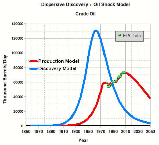
EDIT (1/31/11): In the book, the last prediction of global crude production I made was a while ago. Here is an update:


The chart above is the best guess model from 2007 using the combined Dispersive Discovery+Oil Shock Model for crude. Apart from a conversion from barrels/year to barrels/day, this is the same model as I used in a 2007 TOD post and documented in The Oil ConunDRUM. The recent data from EIA is shown as the green dots back to 1980. I always find it interesting to take the 10,000 foot view. What may look like a plateau up close, may actually be part of the curve at a distance.

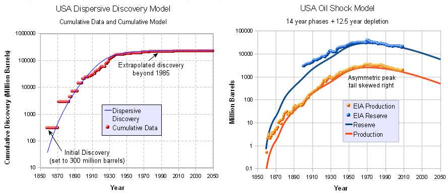
EDIT (2/22/2011): An additional USA Shock Model not included in the book. I included Alaska in this model.

Discovery data transcribed from this figure; the discoveries seem to end in 1985, so I extended the data with a dispersive discovery model. I added in Alaska North Slope at 22 billion barrels in 1968 and a small 300 million barrel starter discovery in 1858.
.
The blue line in the Dispersive Discovery Model is this equation, which is essentially a scaled version of the world model:
DD(t)=(1-exp(-URR/(B*((t-t')^6))))*B*((t-t')^6), URR=240,000 million barrels, B=2E-7, t'=1835.

I did not include any perturbation shocks to keep it simple. Apart from the data, the following is the entirety of the Ruby code; the discovery.txt file is yearly discovery data, which is from the first graph. The second graph shows reserve.out and production.out.


cat discovery.txt | ruby exp.rb 0.07 | ruby exp.rb 0.07 | ruby exp.rb 0.07 > reserve.out
cat reserve.out | ruby exp.rb 0.08 >production.out

$ cat exp.rb

def exp(a, b)
rate = b
length = a.length
temp = 0.0
for i in 0..length do
output = (a[i].to_f + temp) * rate
temp = (a[i].to_f + temp) * (1.0 - rate)
puts output
end
end
exp(STDIN.readlines, ARGV[0].to_f)

Saturday, January 08, 2011

Terrain Slopes

Entropy makes its mark everywhere. Take the case of modeling topography. How can we model and thus characterize disorder in the earth's terrain? Can we actually understand the extreme variability we see?

If we consider that immense forces cause upheaval in the crust then we can reason that the energy can also vary all over the map, so to speak. The process that transfers potential energy into kinetic energy to first order has to contain elements of randomness. To the huge internal forces within the earth, generating relief textures equates to a kind of brownian motion in relative terms -- over geological time, the terrain amounts to nothing more than inconsequential particles to the earth's powerful internal engine.

In a related sense the process also resembles the pressure distribution in the earth's atmosphere, a classic application of maximum entropy that we can re-apply in the case of modeling terrain slope distributions.

Premise. We take the terrain slope S as our random variable (defined as rise/run). The higher the slope, the more energetic the terrain. Applying Maximum Entropy to a section of terrain, we can approximate the local variations as a MaxEnt conditional probability density function:
p(S|E) = (1/cE) * exp(-S/cE)
where E is the local mean energy and c is a constant of proportionality. But we also assume that the mean E varies over a larger area that we are interested in, as in the superstatistical sense of applying a prior distribution.
p(E) = k*exp(-k*E)
where k is another MaxEnt measure of our uncertainty in the energy spread over a larger area.

The final probability is an integral over the marginal distribution consisting of the conditional multiplied by the prior:
p(S) = integral p(S|E) *p(E) dE from E=0 to infinity
This integrates as a BesselK function of the zero order, K0, available on any spreadsheet program (see here for a similar derivation in an unrelated field).
p(S) = 2/S0 * K0(2*sqrt(S/S0))
The average value of the terrain slope for this distribution is simply the value S0.

Now we can try it on a large set of data. I downloaded all the DEM data for the 1 degree quadrangles (aka blocks/tiles) in the USA from the USGS web site. http://dds.cr.usgs.gov/pub/data/DEM/250/

This consists of post data at approximately 92 meter intervals (i.e. a fixed value of run) at 1:250,000 scale for the entire USA. I concentrated on the lower 48 and some spillover into Canada. I used curl to iteratively download each of the nearly 1000 quadrangle files on the server.

I then wrote a program to read the data from individual DEM files and calculate the slopes between adjacent posts and came up with an average slope (rise/run) of 0.039, approximately a 4% grade or 2.2 degrees pitch. I take the absolute values of all slopes so that the average is not zero.

The cumulative plot of terrain slopes for all 5 billion calculated slope points appears on the following chart (Figure 1). I also added the cumulative probability distribution of the BesselK model with the calculated average slope as the single adjustable parameter.

Figure 1: CDF of USA DEM data and the BesselK model with a small variation in S0 (+/-4% about the average 0.037 rise/run) demonstrating sensitivity to the fit.

This kind of agreement does not just happen because of coincidence. It occurs because random forces contribute to maximizing the entropy of the topography. Enough variability exists for the terrain to reach an ergodic limit in filling the energy-constrained state space.

As supporting evidence, it turns out that we can generate a distribution that maps well to the prior by estimating the average slope from the conditional PDF of each of the 922 quadrangle blocks and then plotting this aggregate data set as another histogram (see Figure 2).

Figure 2: Generation of the prior distribution by taking the average slope of each of the nearly 1000 quadrangles . The best fit generates a value of S0 (1/27=0.037) close to that used in Figure 1.

Practically speaking, we see the variability in slopes expressed at the two different levels. The entire USA at the integrated (BesselK model) level and the aggregated regions at the localized (exponential prior) level. These remain consistent as they agree on the single adjustable parameter S0 .

The modeled distribution has many practical uses for analysis, including transportation studies and planning. Obviously, vehicles traveling up slopes use a significant amount of energy and you might like to have a model to base an analysis on without having to rely on the data by itself. (As a caveat, I did not include any of the spatial correlations that must also exist and might prove useful as well)

Perusing the recent research, I couldn't find anyone that had previously discovered this simple model. Not that they haven't tried, coming up with a good slope distribution model seems to amount to a mini Holy Grail among geophysicists. I went as far as dropping $10 to downloading the first paper, which turned out to be a bust.
  1. Probabilistic description of topographic slope and aspect.
    G. Vico and A. Porporato, JOURNAL OF GEOPHYSICAL RESEARCH, VOL. 114, F01011, doi:10.1029/2008JF001038, 2009
    http://www.agu.org/journals/jf/jf0901/2008JF001038/2008JF001038.pdf
  2. Nonlinear Processes in Geophysics Multifractal earth topography.
    J.-S. Gagnon, S. Lovejoy, and D. Schertzer, Nonlin. Processes Geophys., 13, 541–570, 2006
    http://hal.archives-ouvertes.fr/docs/00/33/10/93/PDF/npg-13-541-2006.pdf
  3. PROPAGATION OF DEM UNCERTAINTY: AN INTERVAL ARITHMETIC APPROACH.
    G Gonçalves, XXII International Cartographic Conference, 2005
    http://www.cartesia.org/geodoc/icc2005/pdf/oral/TEMA7/Session%202/GIL%20GON%C7ALVES.pdf
  4. SAR interferometry and statistical topography.
    Guarnieri, A.M. IEEE Transactions on Geoscience and Remote Sensing, Dec 2002
    http://home.dei.polimi.it/monti/papers/montiguarnieri02.pdf
If someone wants to generate Monte Carlo statistics for the BesselK model without having to do the probability inversion, the algorithm turns out surprisingly simple. Draw two independent random samples from a uniform [0.0 .. 1.0] interval, apply the natural log to each, multiply them together, and then multiply by the S0 scaling constant. That will give the following cumulative if done 5 billion times, which is the same size as my USA DEM data sample.

Figure 3: Generation of the BesselK model via Monte Carlo.

The only statistical noise is at the 1e-9 level, same as in the DEM data.

Examples of some random-walk realizations drawing from a two-level model follow. The flatter regions occur more often reflecting the regional data.

Saturday, October 23, 2010

Understanding Recovery Factors

A recent TOD post on reserve growth by Rembrandt Kopelaar motivated this analysis.

The recovery factor indicates how much oil that one can recover from the original estimate. This has important implications for the the ultimately recovery resources, and increases in recovery rate has implications for reserve growth.

First of all, we should acknowledge that we still have uncertainty as to the amount of original oil in place, so that the recovery factor has two factors of uncertainty.

The cumulative distribution of reservoir recovery factor typically looks like the following S-shaped curve. The fastest upslope indicates the region closest to the average recovery factor.

Figure 1: Recovery Factor cumulative distribution function (from)

To understand the spread in the recovery factors, one has to first realize that all reservoirs have different characteristics. Some are more difficult to extract from and others have easier recovery factors. One of the principle first-order effects has to do with the size of the reservoir: bigger reservoirs typically have better recovery factors and as one reservoir engineer mentioned on TOD
"Reserve growth tends to happen in bigger fields because thats where you get the most bang for your buck"
So if we make the simple assumption that cumulative recovery factors (RF) have Maximum Entropy uncertainty or dispersion for a given Size:
P(RF) = 1-exp (-k*RF/Size)
this makes sense as the recovery factor will extend for larger fields.

Add to the mix that reservoir Sizes go approximately as (see here):
Pr(Size)= 1/(1+Median/Size)
Then a simple reduction in these sets of equations (with the key insight that RF ranges between 0 and 1, i.e. between 0 and 100%) gives us
P(RF) = 1 - exp(-k*RF*RF/(1-RF)/Median)
the ratio Median/k indicates the fractional average recovery factor relative to the median field size.

A set of curves for various k/Median values below:


Figure 2: Recovery Factor distribution functions assuming maximum entropy

Rembrandt provided some recovery factor curves originally supplied by Laherrere, and I fit these to the Median/k fractions below.

Figure 3: Recovery factor curves from Rembrandt's TOD post,
alongside the recovery factor model described here.

Laherrere also provided curves for natural gas, where recovery factors turn out much higher.

Figure 4: Recovery Factor distribution functions for natural gas.
Note that the recovery factor is much higher than for oil.
(Note: I had to fix the typo in the graph x-axis naming)

It looks like this derivation has strong universality underlying it. This remains a very simple and parsimonious model as it has only one sliding parameter. The parameter Median/k works in a scale-free fashion because both numerator and denominator have dimensions of size. This means that one can't muck with it that much -- as recovery factors increase, the underlying uncertainty will remain and the curves in Figure 2 will simply slide to the right over time while adjusting their shape. This will essentially describe the future reserve growth we can expect; the uncertainty in the underlying recovery factors will remain and thus we should see the limitations in the smearing of the cumulative distributions.

To reverse the entropic dispersion of nature and thus to overcome the recovery factor inefficiency, we will certainly have to expend extra energy.


Wednesday, October 20, 2010

Bird Surveys

This post either points out something pretty obvious or else it reveals something of practical benefit. You can judge for now.

I briefly made a reference to bird survey statistics when I wrote this post on econophysics and income modeling. I took a typical rank histogram of bird species abundance and fit it the best I could to a dispersive growth model, further described here. The generally observed trend follows that many species exist in the middle of abundance and relatively small numbers of species exist at each end of the spectrum -- few species exceedingly common (i.e. starling) and few species exceedingly rare (i.e. whooping crane). Since the bird data comes from a large area in North America, the best fit followed a meta-community growth model. The meta-community adjustment impacts the knee of the histogram curve and broadens the Preston plot, effectively smearing over geological ages that different species have had to adapt.

Figure 1: Preston plot (top) and
rank histogram (bottom) of relative bird species abundance

If we assume that the relative species abundance has a underlying model related to steady-state growth according to p(rate), where rate is the relative advantage for species reproduction and survival, then this should transitively might apply to disturbances to growth as well. Recently, I ran into a paper that actually tried to discern some universality in diverse growth papers, and it coincidentally used the bird survey data along with two economic measures of firm size and mutual fund size.
I did the best I could with the figures in the paper but eventually went to the source, ftp://ftpext.usgs.gov/pub/er/md/laurel/BBS/DataFiles/, and used data from 1997 to 2009.

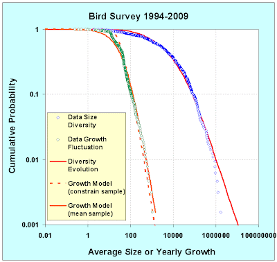
I applied the same abundance distribution as before and came up with the fit below (see blue and red curves below, data and model respectively). That provided a sanity check, but Schwarzkopf and Farmer indicated that the year-to-year relative growth fluctuations should also obey some fundamental behavior through the distribution of this metric:
RelativeGrowth(Year) = n(Year+1) / n(Year)
Sure enough, and for whatever reason, the "growth" in the surveyed data does show as much richness as the steady state averaged abundance distribution. The relative growth in terms of a fractional yearly change sits alongside the relative abundance curve below (in green). Notice right off the bat that the distribution of fractional changes drops off much more rapidly.

Figure 2 : The red meta-model curve smears the median from 200 to 60000

I believe that this has a simple explanation having to do with Poisson counting statistics. When estimating fractional yearly growth, we consider that the rarer bird species having the lowest abundance will contribute most strongly to fluctuation noise on year-to-year survey data. Values flipping from 1 to 2 will lead to 100% growth rates for example. (We have to ignore movements from 1 to 0 and 0 to 1 as these growths become infinite.

I devised a simple algorithm that takes two extreme values (R greater than 1 and R less than 1 ) and the steady state abundance N for each species. The lower bound of:
R1 = R * (1-sqrt(2/N))/(1+sqrt(2/N))
and the upper bound becomes:
R2 = R * (1+sqrt(2/N))/(1-sqrt(2/N))
The term 1.4/sqrt(N) derives from Poisson counting statistics in that the relative changes become inversely related to the size of the sample. We double count in this case because we don't know whether the direction will go up or down, relative to R, a number close to unity.

(This has much similarity to the model I just used in understanding language adoption. Small numbers of adopters experience suppressing fluctuations as 1/sqrt(N))

Expanding on the scale, the results of this algorithm are shown in Figure 3.

Figure 3 : Model of yearly growth fluctuation in terms of a cumulative distribution function

Placing it in terms of a binned probability density function, the results look like the following plot. Note the high counts match closely the data simply because the 1/sqrt(N) is relatively small. Away from these points, you can see the general trend develop even though the data is (understandably) obscured by the same counting noise.

Figure 4 : The probability density function of yearly growth fluctuations.

As an essential argument to take home, consider that a counting statistics argument probably accounts for the yearly growth fluctuations observed. Before you make any other assertions, you likely have to remove this source of noise. Looking at Figure 3 & 4, you can potentially see a slight bias toward positive growth for certain lower abundance species. This comes at the expense of lower decline elsewhere, except for some strong declines in several other low abundance species. This may indicate the natural ebb and flow of attrition and recovery in species populations, with some of these undergoing strong declines. I haven't done this but it makes sense to identify the species or sets of species associated with these fluctuations.

Two puzzling points also stick out. For one, I don't understand why Schwarzkopf and Farmer didn't immediately discern this effect. Their underlying rationale may have some of the same elements but it gets obscured by their complicated explanation. They do use a resampling technique (on 40+ years worth of data) but I didn't see much of a reference to conventional counting statistics, only the usual hand-wavy Levy flight arguments. They did find a power law of around-0.3 instead of the -0.5 we used for Poisson, so they may generate something equivalent to Poisson by drawing from a similar Levy distribution. Overall I find this violates Occam's razor, at least for this set of bird data .

Secondly, it seems that these differential growth curves have real significance in financial applications. More of the automated transactions look for short duration movements and I would think that ignoring counting statistics could lead the computers astray.


Epilogue

As an aside, when I first pulled the data off the USGS server, I didn't look closely at the data sets. It turns out that the years 1994,1995,1996 were included in the data but appeared to have much poorer sampling statistics. From 1994 to 1996, the samples got progressively larger but I didn't realize this when I first collected and processed the data.

Figure 6 : CDF of larger data sample.
Note the strange hitch in the data growth fluctuation curve.

At the time, I figured that the slope had a simple explanation related to uncertainties in the surveying practice. I also saw some similarities to the uncertainties in stock market returns that I blogged about recently in an econophysics posting.

Say the survey delta time has a probability distribution with average time -- the T most likely related to the time between surveys:
pt(time) = (1/T)*exp(-time/T)
then we also assume that a surveyor tries to collect a certain amount of data, x, during the duration of the survey. We could characterize this as a mean, X, or some uniform interval. We don't have any knowledge of higher order moments to we just apply the Maximum Entropy Principle
px(x) = (1/X)*exp(-x/X)
The ratio between these two establishes the relative rate of growth, rate = X/T. We can derive the following cumulative quite easily:
P(rate) = T*rate/(T*rate +X)
The yearly growth rate fluctuations of course turn out as the second derivative of this function. We take one derivative to convert :
dp(rate)/drate = 2*T/X/(1+rate*T/X)^3
On a cumulative plot as in Figure 6, this shows a power-law of order 2 (see the orange curve). Near the knee of the curve, it looks a bit sharper. If we use a uniform distribution of px(x) up to some maximum sample interval, then it matches the knee better (see the dashed curve).

So the simple theory says that much of the observed yearly fluctuation may arise simply due to sampling variations during the surveying interval. Plotting as a binned probability density function, the contrast shows up more clearly in Figure 7. In both cases is fit to X/T = 60. This number is bigger than unity because it looks like every year, the number of samples increases (I also did not divide by 15, the number of years in the survey).

But of course, the reason this maximum entropy model works as well as it does came about from real variation in the sampling techniques. Those years from 1994 to 1996 placed enough uncertainty and thus variance in the growth rates to completely smear the yearly growth fluctuation distribution.

Figure 7 : PDF of larger sample which had sampling variations.
Note that this has a much higher width than Figure 4.

Only in retrospect when I was trying to rationalize why a sampling variation this large would occur in a seemingly standardized yearly survey, did I find the real source of this variation. Clearly, the use of the Maximum Entropy Principle explains a lot, but you still may have to dig out the sources of the uncertainty.

Can we understand the statistics of something as straightforward as a bird survey? Probably, but as you can see, we have to go at it from a different angle than that typically recommended. I will keep an eye out if it has more widespread applicability; for now it obviously requires countable discrete entities.