Macro Peak Oil Model vs Logistics Curve
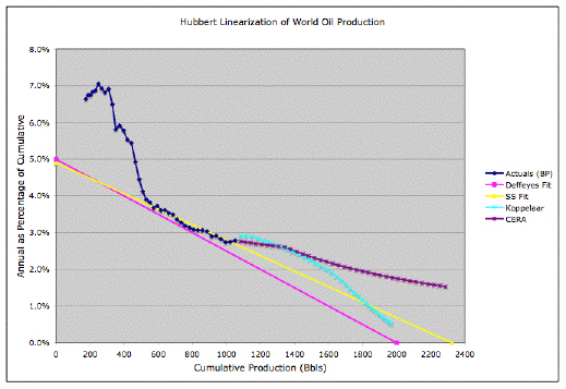
Stuart Staniford posting at The Oil Drum tried out some fits of a logistics curve to oil production data from Beyond Petroleum/British Petroleum's report on World Energy 2005. He noted:
In the beginning, the data are crazy, but after about 1958, they settle down into pretty much a linear regime (with a little noise) that has held good ever since. The nice thing about this method is that you do not need to input an estimate for the URR. Instead, you extrapolate the straight line, and it tells you the URR.I find the highlighted part revealing in that Staniford conveniently sweeps perfectly good data under the rug. I always say never attribute to crazy what probably has a rational explanation.

So what exactly causes that initial precipitous drop in the dark blue curve that nobody wants to fit to? And why do analysts want to work in the so-called "stable" regime where the logistics curve seems to work so well? Well, I believe it has to do with the use of the logistics curve itself, which has no intuitive meaning to how the world actually works.
I came up with a more realistic yet very simple depletion model a few months ago in two posts called A Macro Peak Oil Model, Part 1 and Part 2. You can review the details at the two links, but a typical model result looks like the following yellow "Bell-shaped" curve:

To match up against the logistics curve plot, which Staniford and Deffeyes use to "linearize" the data,
dQ/dt / Q = k(1-Q)I simply had to integrate the simple production curves to obtain the cumulative (Q) number. My plot looks like the following, with a depletion rate of 0.03/year tacked on to the 130-year-span triangular discovery curve:

Notice that we get a perfectly understood dropoff (perhaps quasi-hyperbolic) before it settles into a more-or-less linear regime as at heads to a zero production rate when we hit the cumulative production limit.
I will look into the details a bit more later, but for now it appears a bit more optimistic than the logistics fit, as it tends to flatten out in the out years.


3 Comments:
yep, when you start throwing away data to fit your model, you know you are on the wrong track. The pesky real world is intruding on your assumptions. It will likely as not interject itself once again when you least expect it. I like what you've done here.
Thanks.
I have also discovered that the cusp on the production curve is due to a large cumulative production added at the front which USGS numbers don't support. I gotta tell Sandiford about that deal.
Thanks for doing this - I just stumbled onto it now. As an OD reader, I have a lot of problems with the simplistic line-drawing approach Stuart uses in his logistics models. Hell, there wasn't even an attempt to do an applied linear regression with the linear-looking component of the curve - it was just eyeballing.
Post a Comment
<< Home