
Entroplets of City Population
Revisiting a post from last year, I wanted to add some information as relayed to me by Laherrere. He had previously worked the distribution of population size distributions [1] which used urban aggregates instead of city population sizes. I had fit the entroplet curve to the data shown in the following figure (thin blue line).
 The model fit departs from the data within certain regions of the profile. It really comes down to distinguishing between major metropolitan areas and large cities. Ranking by major metropolitan and you find that we have 50 major metropolitan areas greater than 1 million, but only 10 cities greater than 1 million. The greater New York City metro region has between 21 to 22 million people and Los Angeles has between 12 and 13 million, which puts the first two ranked points above the chart area. So you can imagine filling adjusting the rest of the curve by borrowing population centers of less than 100,000, and adding to the cities to model the major metropolitan regions. These essentially constitute the "suburbs" of any large city, with most suburbs in the USA falling between 10,000 and 100,000 in population size. So to do this correctly, it would require someone to categorize a few thousand additional cities to find out if they belong to the previously categorized major metropolitan areas. On a log-log histogram, and with this shape of entroplet curve, the areas between the curve within the fat-tail have approximately equal population, so that you can imagine the city data shifting from one region to the other, as in the white patches of the curve below.
 Laherrere did some of this in his paper and you can see the results in the figure below, where the red set of data indicates the effects of urban agglomeration. Unfortunately, he did not continue that below areas of 100,000 in population.
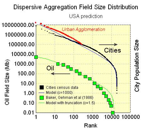
Urban agglomeration likely follows dispersion patterns better than a city population distribution does because cities form political boundaries which have nothing to do with the actual physical process of growth; preferential attachment would occur to the region and not the city.
So for now, I can't do much more than show approximately how the shift occurs. It would take quite a bit of data rearrangement to correctly classify as a true isolated city as opposed to an agglomerated metro region.
Interestingly, the same process likely occurs for oil reservoir accounting. Whether a large reservoir can include additional adjacently situated "satellite" reservoirs has to do more with oil companies accounting practices more than anything else. And I have no control over that so we do the best we can with the available data
Reference
[1] Laherrère J.H., D.Sornette 1998 " Stretched exponential distributions in nature and economy: fat tails» with characteristic scales" European Physical Journal B 2, April II, p525-539 : http://xxx.lanl.gov/abs/cond-mat/9801293
posted by @whut at March 14, 2010
![]()
![]()


0 Comments:
Post a Comment
<< Home