Oil production models
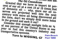
 Khebab did a great job aggregating various oil depletion models to compare against November production numbers at TOD. He split them up according to "bottom-up" models and "curve-fitting" models, which seems like a smart and fresh way of doing things. My analysis falls in the curve fitting camp, so I have to thank him personally for allowing us amateurs to play with the big boys. FWIW, the Oil Shock model seems to follow most closely the ASPO-45 model for the next ten years.
P.S. The best unintentional Peak Oil cartoon ever.
posted by @whut at November 25, 2006
![]()
![]()


2 Comments:
Best cornucopian explanation cartoon ever ....
http://www.sciencecartoonsplus.com/gallery.htm
This one has soooo many applications.
That one is an old classic from The New Yorker.
Post a Comment
<< Home